Average Jeans Color By State, Shown In Map Form
A 2018 chart, created by an unknown entity, depicts the favorite jeans color of every state, however, it was later proven to be false information and serves as an example that highlights how much misinformation circulates on the internet.
This article is more than 2 years old
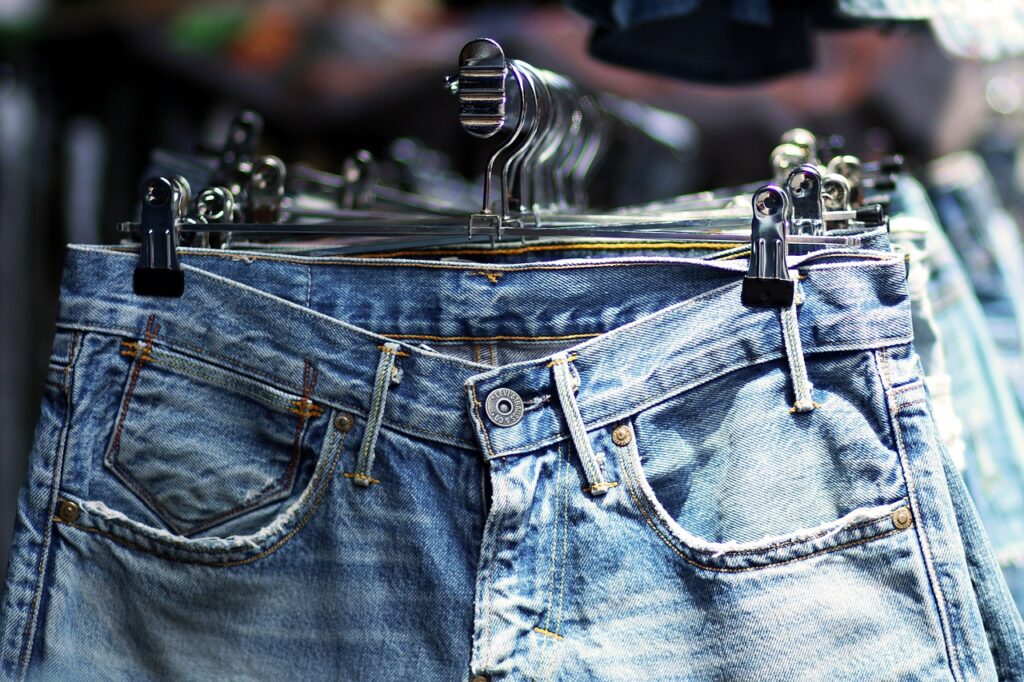
Transcending time, trends, and social class, blue jeans are arguably the most-worn item of clothing on the planet. Their popularity is so great that legendary designer Yves Saint Laurent once said he wished he had invented them. “They have expression, modesty, sex appeal, simplicity – everything I hope for in my clothes,” he said. Then, two years ago, a post ranking the preferred jeans color by state started doing the rounds on social media.
While the map was deemed fake since it was initially created as a cautionary tale about manipulated internet facts, a user on Medium named Khyatee Desai, created her own survey about jeans color. The first step involved researching the source and method used to create the original map (as seen above). Desai scoured the internet and eventually concluded that the origin of the image remains a mystery.
There were also no pre-existing datasets about jeans color popularity, cementing the fakeness of the 2018 diagram. Since the required data didn’t exist, Desai started collecting data from scratch. She began with a survey that asks for information like age, state of residency, and the participant’s favorite shade of denim – chosen from a selection of eight options. She shared the survey with friends, and family, on social media and in various online forums.
At the time of writing in 2020, she received 377 responses about jeans color. The next step involved deriving RGB and hex values from the eight denim picture samples in the survey. Desai accomplished this by using a Python library called Color Thief, which can capture the RGB color palette from an image. The program uses “k-means” clustering to return the k most dominant colors in an image. The number of colors to grab with the color count parameter can be specified.
After grabbing the RGB values for each image, Desai wrote a function to display each original image alongside its dominant colors in a pie chart. She did map these colors to each survey response using Pandas DataFrame. The next task involved averaging the responses to arrive at one jeans color per state. So she grouped the data by location while taking the mean of each RGB value to derive the average RGB per state. This average was then converted to its corresponding hex value and added to the DataFrame.
The last step in the real survey was to create a new jeans color map. This involved locating a shapefile representing United States borders. This file contains GIS data on a specific location’s spatial and geographic information. Desai merged the shapefile with the DataFrame by using a package called GeoPandas to create a GeoDataFrame.
However, Desai does caution against drawing any big conclusions from the jeans color mapping since the results only represent 377 survey responses. It isn’t nearly large enough to legitimize a relationship between color preference and location. The respondents also do not represent an independent, random sample as the responses are from Desai’s circle of family, friends, and colleagues.
Additionally, most people surveyed about their jeans color preference fall into a similar demographic, socioeconomic status, and education level as the researcher. As a result, this sample was not truly representative of the United States population, but at least it’s not fake.