Sherwin Williams Repose Gray Review
This article is more than 2 years old
Have you been looking for the right paint? Keep reading to have an idea of how this Sherwin Williams Repose Gray review will be a game-changer for you:
What color is Sherwin Williams Repose Gray?
Repose gray may look like color with a gray undertone, but guess what? It has a taupe undertone. It is indeed a gray color, soft gray in particular. The shade is sometimes regarded as a ‘greige’ because it is considered to be in-between gray and beige. However, others like to call it a neutral and light gray, which makes it most suitable for its interior and exterior.
Sherwin Williams Repose Gray reviews:
Having slight undertones are what the users’ favorite thing about Repose Gray is. They love how it is on known as a mediocre warm gray which doesn’t look muddy or brown even during the night time when there is less light or in dimly lit rooms like a kitchen without windows. A color like Repose gray also allows a variety of combinations to be adopted in the rooms, which has proved to be very beneficial for the interior designers. Whether you want to go for light and simple or bold and sophisticated accessories and patterns in the rooms, Repose Gray is always a valuable color to go with their styles. Wood flooring and carpeted floor rooms are one of the most trending styles for the tiling these days, and Repose Gray has a wonderful contrast with them. This It is also one of the major reasons why Repose Gray is so preferred because you would want a color in your house that would go with many types of furnishings so that you don’t have to repaint your walls when bringing in new furniture.
Why is Repose Gray popular?
A color like Repose gray, which is so neutral and unique, is always considered essential in the interior design world. The popularity of Repose Gray is primarily linked to its taupe undertones, and it’s the ability to contrast with multiple types of interiors that have been highlighted before.
Light has a quite appealing effect on the tone of Repose Gray. It develops a light purple color but in a quite pleasing way. Especially if the lights are too dim, you will be able to notice it; otherwise, it isn’t remarkable. However, it is this quality of Repose Gray that it has different undertones under different circumstances that make it so alluring. After all, paint can alter the entire vibe of the room by just being on the walls. Unlike the other grays such as Agreeable gray, it is warm, which is very untypical for it since most grays are cool. Its warmth adds tranquility to the room and creates a soothing environment in my room, which only some colors are able to do. Some colors stand out so much that rooms feel a little suffocating when you come in to rest after a long day. Your bedroom, especially, should feel like the place your mind relaxes. Repose Gray is known to be able to make you feel that way and calm your nerves. It doesn’t get suffocating but comforting due to the taupe undertones.
Sherwin Williams Repose Gray Uses?
There are more than just one answer to where Repose Gray can be used. Like many other colors by Sherwin Williams, Repose Gray is suitable for use in every part of your home and in a variety of ways as well. You can use Repose gray to paint patterns on your walls or on an accent wall combining it with other coordinating colors such as Sherwin Williams Pavestone, Eider White, and Coral Clay.
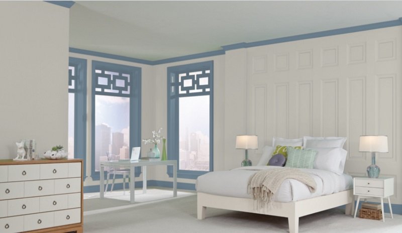
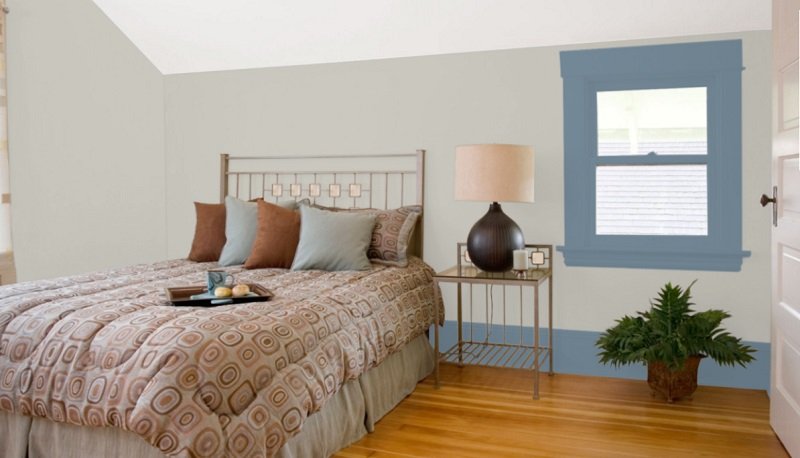
Sherwin Williams Repose Gray bedroom:
This is absolutely everyone’s favorite use of Repose Gray. Whether you are looking for something simple or extravagant, Repose Gray can do it both. It’s warm gray color looks beautiful in a room with a wooden floor or carpeted floor. White carpets and headboards match with each other, along with matching the gray walls. What you need to do in a room painted in Repose Gray is to add a lot of wall accessories. The light color alone can get boring for those who like something fancy, but an accessory or two can totally change it from being lifeless to full of life.
However, if you’re going for brown wood furniture, you need nothing else than just your bed, side tables, and dressing table to build a stylish room. If not, you still have nothing to worry about because Repose Gray will fit in with any color light or dark. You can hang up silk and rayon curtains by the windows but don’t block sunlight coming in because sunlight can bring out the lavender undertone in Repose Gray, which looks beautiful in the morning time.
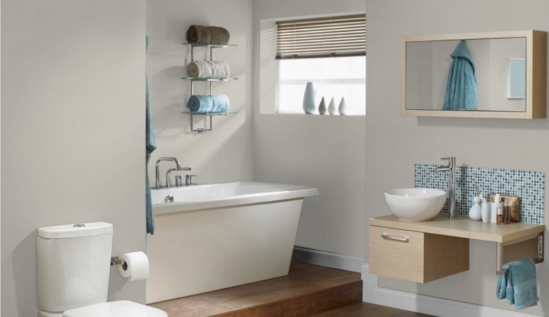
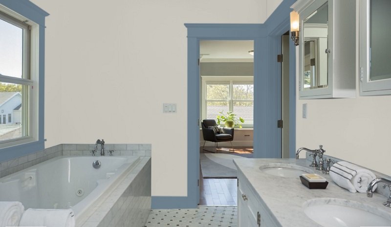
Sherwin Williams Repose Gray bathroom:
For an anti-stress mood in your bathroom, Repose Gray is ideal. The warmth in the tone of Repose Gray gives your bathroom a subtle look. The gray color contrasts with the metal appliances in your bathroom and bathroom furniture. The best part is that you can paint the cabinetry in other dark colors as well, such as Sherwin Williams Coral Rose and Memorable Rose, for drift to something appealing. You should use granite or marble for your vanity counter and floor. Light wood floors go incredibly well with Repose Gray and give your bathroom a discerning appearance. Repose Gray’s warmth also adds a stress-relieving ambiance to the bathroom, which is significant while taking candlelight and bubble baths. The wooden floor can also be in chalk gray for a distinct look in your bathroom.
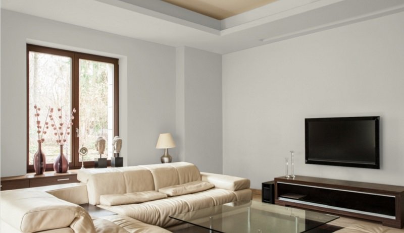
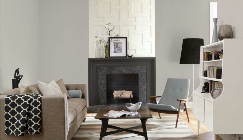
Sherwin Williams Repose Gray Living Room:
Living rooms are the place where you are most likely to put up a lot of accessories on the walls. You need a color that adds life to the room as well as functions as a very suitable background. Repose Gray is neutral, which means you never have to worry if your wall accessories and living room furniture goes with it or not when buying them. You can combine it with Sherwin Williams Sea Salt to paint patterns on your accent wall as both colors contrast perfectly with each other. The best color for couches would be white, but it might get too simple for everyone. Feel free to bring in teal, pink or dark blue couches because Repose Gray will work with any of them. It is like the white color, which goes with every other color, be it bold blues and greens or light pinks and purples. You can out a chandelier in the middle of the room so that light falls on all the walls, and Repose Gray can display its lavender undertones.
Sherwin Williams Repose Gray Garden:
Also, if you have a garden outside, you can paint it’s walled in Repose Gray as it looks beautiful with the greens. However, if you don’t have them, you can just put flower vases in your living room with lilies or roses. You can simply allocate an area for some plants and paint the area in Repose Gray, and the greenery will pop out more under the shade of the gray painted walls.
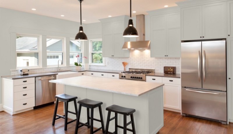
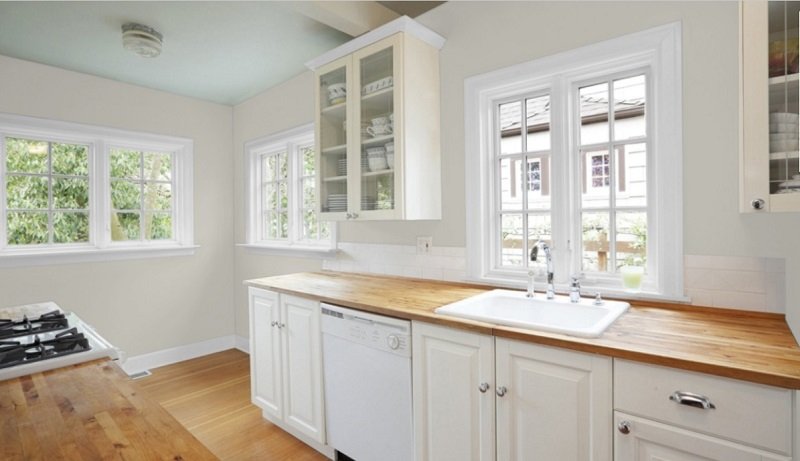
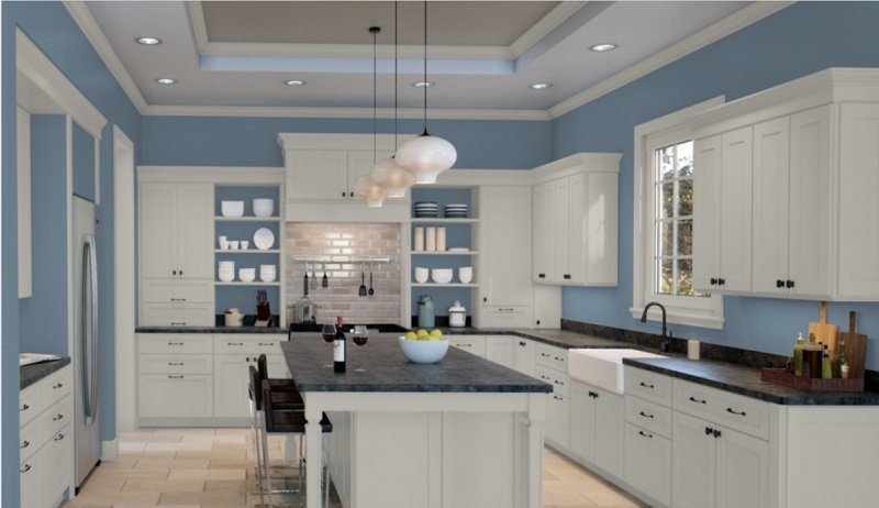
Sherwin Williams Repose Gray Kitchen:
You can use a variety of colors in your kitchen, but the colors that are most used in the kitchen are whites and grays. Repose Gray can help you build a simple fascinating kitchen. It is its ability to contrast with so many colors that allow the evolution of new styles in the kitchen. It goes with coconut white tiling and kitchen islands mostly, but if you’re going for something bolder, you can go for black as well. It is also a great idea to allocate an accent wall in your kitchen and paint it with a darker gray than Repose Gray, such as Sherwin Williams Quest Gray, while leaving the other walls to be painted with Repose Gray. It will make your kitchen a place you wouldn’t ever feel tired of working in. If you are unwilling to make an accent wall, then you can adopt this idea on your backsplash, and it will also cover any stains the walls can get from cooking.
Sherwin Williams Repose Gray dining room:
Who wouldn’t want their dining area to feel like they are eating out in a luxurious restaurant? It can simply elevate your mood for food after an exhausting day or a restless night. Again, there are numerous ways to contrast hardwood floors and soft white or even brown dining tables and chairs with the warm Repose Gray. Off-white color also looks amazing with Repose Gray and the wooden dining table. Together, they give the dining room the utmost grace. You can put up a chandelier in the middle of the ceiling above your table. An artificial flower vase on the table and other accessories will be enough to enhance the beauty of your dining room.
Sherwin Williams Repose Gray cabinets:
It is totally up to you if you want to go for it all alone or combine with other coordinating colors such as Sherwin Williams Dovetail. Cabinets would look very fashionable either way. The gray will totally pop out against white countertops and chalk gray, hardwood floors. Cabinets look particularly good in light colors than dark ones, so Repose Gray will be perfect. Repose Gray looks flawless on the bathroom cabinetry as well. You can assign a wall against which you will have your bathroom mirror and vanity counter. That wall only should be in brick style painted in a dark gray. The tiles should be dark gray ceramic tiles. These both belong together and will definitely look chic with each other. What you add is a few artificial plants in the bathroom for something more. You will appreciate how beautiful your cabinets look when you are curled up in a bubble bath amidst a pair of candles shining on the cabinet and revealing the softness of Repose Gray. Moreover, the paint color will come handy in laundry room cabinets as well, which you wouldn’t want to be foo fancy but presentable, and some Repose Gray paint will just do.
Sherwin Williams Repose Gray sunroom:
Repose Gray is one of those colors which work in rooms like these. Since the sunroom would allow a lot of exposure to Repose Gray with the natural light, it will bring out the lavender undertones in it, giving it a dreamy look. You can build a very simple yet elegant sunroom with Repose Gray. The paint color wouldn’t look unnecessarily extra in such a room where you just sit and relax but will create a cozy vibe that would make you want to grab a tropical drink and chill in the sun. You can hang up white silk drapes just for a little style. The floor can be wooden or simple ceramic white tiles would do too. A couple of wooden armchairs and table will be enough for the sunroom to be as chic as it can look. However, there are many other ideas that you can incorporate in the sunroom with Repose Gray walls.
What are the undertones of Repose Gray?
Repose Gray has more than just one undertone. Basically, it has a gray undertone with a tinge of brown. It entirely depends on the lighting in your room. Generally, Repose Gray has a beige undertone, but if you look at it under sunlight, it will reveal a greenish undertone. Under white lights, you might be able to notice a very unremarkable purple undertone in Repose Gray, but don’t let that bother you because users have claimed to love it despite the slightly purple undertones. To see the actual color of Repose Gray, you can simply paint a small amount on an area where there isn’t too much natural light coming in but just enough for you to see.
Warm or cool, what is Repose Gray?
Most grays are cool, but Repose Gray is warm. You won’t deny it when you look at it closely on a wall. Repose Gray is a unique soft and warm color. However, it doesn’t settle for just being a warm gray. Repose Gray has the characteristic to pick up the cool undertones around it. When you look at Repose Gray individually, you will characterize it as a warm shade, but when it is place side by side with other colors to compare, you would not be able to just resolve to it being gray. So, like most other colors, it’s the texture. It is highly dependent on the colors around it.
Repose Gray Swatch:
It is always recommended to try out a sample of paint before you finalize the paint color. The outcome of a particular paint can turn out to be very different from what you see in pictures and other houses because there are certain factors that affect it. Swatches are available both online and in-stores. Peel and stick paint samples will be given to you, and you can easily circle it around in different parts of your home for testing, which would be very difficult with a bucket of paint. It can be a complete waste if you are not getting your desired look. This is not just for Repose Gray, but any new paint you decide to give a try to should be first tested by samples before making the decision to use it or not.
How light changes look of Repose Gray:
Natural light brings out the purple undertones in Repose Gray. In a north-facing room where sunlight is too less for Repose Gray to reveal the lavender tone, it will shift more to a blue, which will make its texture look cool. However, during cloudy days with the least bit of sunlight, it will read the neutral gray it originally is.
Repose Gray coordinating colors:
Repose Gray does have a unique quality of looking good with every color, but there are some specific for you to choose easily rather than being confused between two to three. Coral Gray has been used with Repose Gray a lot of times because both colors contrast. Coral Gray is a warm, orange shade that goes with most of the grays, not just Repose Gray. Other coordinating colors include Pavestone and Eider White. Pavestone has light brown and gray undertones, whereas Eider White is simply white. White always looks classic with Repose Gray because they both are neutrals. Repose Gray is a gray neutral pop out against the white like many other light colors do.
Is Repose Gray too light?
You can’t say Repose Gray is light or dark. It is just in the middle. If Repose Gray was indeed too light, it wouldn’t give the rooms so much life as it does. It would look like a boring beige on the walls. With an LRV of 58, it cannot be regarded as very light. LRV refers to Light Reflectance Value of paint, meaning how much light does a color absorbs or reflects when it falls upon it. Repose Gray is somewhere in between on the scale of grays, making it a neutral gray that blends in perfectly with many, many colors. This is one of the reasons it is so popular in the interior designing world. The LRV suggests that it reflects back much light, which means it doesn’t make a room look too dark but adds a substantial amount of cheer in it to make it look cozy. Considering how low the LRV is in comparison to the other colors of the same class, you can’t say it is too light. Also, the fact that its pigment doesn’t flush out too much in the sunlight tells that it isn’t a very light color.
Why does Repose Gray look green?
Repose Gray is neither green, nor does it have any green undertones. However, there are certain shades that, when combined with it, will bring out the green in it. For example, users have stated that Sherwin Williams Revere Peter makes Repose Gray look a little green. Also, some say that it looks green in a dark room, such as with little lighting and dark floors such as chalk gray hardwood. Again, it really depends on the colors in its surroundings that define what undertone will it reveal.
Does Repose Gray look beige?
Technically, Repose Gray should look beige considering the undertones of it, but designers say it doesn’t. This is why even those who don’t like the beige color do love Repose Gray. Generally, it looks gray but different types and angles of light that falls upon it alter it’s undertones a bit. You would even feel the color is a little shiny in a room with adequate light, which isn’t. However, none has ever complained that it looked beige in their room.
Does Repose Gray look purple?
It does look purple in some scenarios but not the unpleasant types of purple but a beautiful hint of purple, which you can call Lavender. In a room with faint lighting, you might be able to see the Lavender tone Repose Gray develops. However, it is barely visible, and you will need very observing eyesight to catch that tone of purple. Purple is also considered to be one of the multiple undertones of Repose Gray. The softness and warmth in Repose Gray come from this purple undertones.
Does Repose Gray look blue?
The tiny bit and rare cool in Repose Gray come from the blue undertone in it. Repose Gray is said to look blue sometimes, especially in north-facing rooms, because of the less sunlight. With brown woods in these north-facing rooms, there is a high chance that it will tend towards blue towards. This is actually considered normal for grays as they always have some indication of blue in them, which is why most of them are cool. You don’t need to be very concerned about it if you are using Repose Gray because the blue in it is minor that you might even think it’s Lavender. This is the reason why Repose Gray is a warm gray.
Comparison with other colors:
There are many other grays by Sherwin Williams. Some of them are so close to each other that it seems almost impossible to distinguish. This can be both helpful and problematic. It proves to be helpful when you’re looking for an alternative in case your chosen color is unavailable but problematic when you are trying to select one from a variety of them, and they all look right to you. It can be very difficult to make the best choice according to your interior. Here is a list of those various grays and their similarities and differences from Repose Gray.
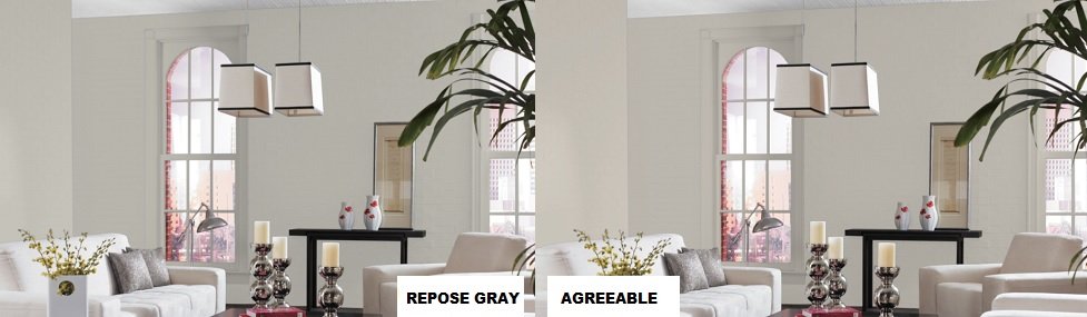
Repose Gray vs. Agreeable Gray:
The choice is very tough to make when it comes to choosing between Repose Gray and Agreeable Gray. The color has yellow and orange undertones. It is called a true beige, which is untrue for Repose Gray, which isn’t a beige color despite having the undertones of it. Even though the undertones are different, the colors are both warm grays, and like Repose Gray, Agreeable gray also seems to be cool in certain conditions. Agreeable Gray itself is darker than Repose Gray on the basis of its LRV; however, if one looks at them together, they observed the green undertones of Repose Gray while Agreeable Gray looks off white.
LRV Compared:
- Repose Gray: 58
- Agreeable Gray: 6
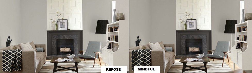
Repose Gray vs. Mindful Gray:
It is interesting to accept how similar the two colors are after comparing their LRVs. Mindful Gray is much darker than Repose Gray. There are no green undertones in Mindful Gray, unlike Repose Gray. Mindful Gray is the exact color you will get if you mix gray and beige. It is a very neutral shade without too many undertones but only a blue one. Still, it doesn’t fall in the category of cool grays. Users say it has a warm texture. Its dark shade allows it to be an incredible contrast color for Repose Gray. Just like Repose Gray, it reveals a blue undertone in north-facing rooms. While the colors may not be suitable substitutes, they are surely a great contrast.
LRV Compared:
- Mindful Gray: 48
- Repose Gray: 58
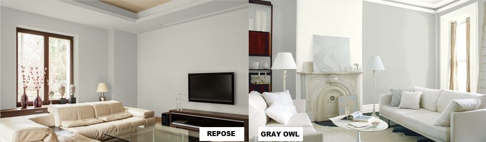
Repose Gray vs. Gray Owl:
Gray Owl is a color by Benjamin Moore. Looking at it on its own will definitely make you see the subtle green color it is. Like Sherwin Williams Repose Gray, it looks beautiful with wooden interiors. Especially, they both give a very tranquil feel to a room with light brown wood furnishings. However, a fundamental difference can be recognized in a room with a lot of natural light. Previously, it has been mentioned that Sherwin Williams Repose Gray looks warm in south-facing rooms, but Benjamin Moore Gray Owl reveals it’s blue undertones in the same room and displays a cool texture. Their LRVs show that Gray Owl is lighter, which can be pretty much concluded from its light and subtle undertones.
LRV Compared:
- Repose Gray: 58
- Gray Owl: 65.77
Repose Gray vs Collonade Gray:
Collonade Gray has the same undertones as Repose Gray: blue, green, blue, and beige. However, the intensity of the undertones is certainly different. Collonade Gray is a ‘greige’ as well. The beige is responsible for the softness in the Collonade Gray, like it is for the softness in Repose Gray. This is why both colors do well in a room with carpeted flooring. The warmth of the room with the carpeted floor is enhanced by painting its walls in colors like Repose Gray or Collonade Gray. Collonade Gray itself doesn’t look like a gray, but when painted on the walls, it certainly does. When you look at the two colors together, you will agree that Collinade Gray is darker and looks off white, and Repose Gray looks like a subtle green.
LRV Compared:
- Repose Gray: 58
- Collonade Gray: 53
Repose Gray vs. Jogging Path:
Jogging Path has a very new undertone: khaki. It is said to have an incredible match with white and navy colors. The khaki undertone stands out against Sherwin Williams Pure White, which is why it is one of the most common combos in the paint world. Sherwin Williams Origami White and Shoji White are the coordinating whites of Repose Gray. However, going with any of these colors with Repose Gray wouldn’t be such a good idea for those who like something radiant on their walls. Jogging Path tends to have a hint of mud gray in it like a jogging path whereas, Repose Gray looks like a neat and pure color.
LRV Compared:
- Repose Gray: 58
- Jogging Path: 49
Repose Gray vs. Useful Gray:
Useful Gray has beige undertones, which makes it a warm color. Unlike Repose Gray, it is merely warm. It also has yellow and green undertones. The yellow makes it light and bright, whereas the green makes it fresh. It is also considered to be the warmest gray and looks very stunning with wooden accessories and furnishings like Repose Gray. Useful Gray blends quite charmingly with Sherwin Williams Greek Villa, Nuance, and Acacia Haze. The gray in Repose Gray become actually visible when one compares these two while Useful Gray would look more of a gray with a green undertone. Judging on the basis of their LRVs, the two colors are most likely to look indistinguishable in all types of lights. The colors would look great in well-illuminated foyers as light has a beautiful effect on the shade of these two paint colors.
LRV Compared:
- Useful Gray: 59
- Repose Gray: 58
Repose Gray vs. Light French Gray:
Light Gray is actually a faded gray in simple terms. Faded gray is the color of rocks. Light French Gray is a neutral and light gray without too many undertones altering it appears light-colored rooms. Since it’s a light color, it looks very good with light-colored furniture as well, such as in mint green. Also, velvet adds to its own warmth. So, in a room with velvet couches, you can use Light French Gray as an awesome background color as well. When you compare the two, it is very obvious that Light French Gray is a true gray, but Repose Gray looks gray with a hint of green somewhere in it. The two colors can be used with each other to paint beautiful and eye-catching patterns on your walls.
LRV Compared:
- Repose Gray: 58
- Light French Gray: 53
Repose Gray vs. Silver Pointe:
Silver Pointe is another light gray shade by Sherwin Williams. It has much more of a white undertone in it than gray. It is basically a chalk gray paint color with some green undertones as well. Repose Gray looks like a darker version of it when they both are placed side by side. Both have warm textures and go with warm furnishings like rugs and carpeted floorings. Silver Pointe is certainly a light gray as it’s LRV suggests whereas, Repose Gray will be considered dark on the same base.
LRV Compared:
- Silver Pointe: 63
- Repose Gray: 58
Repose Gray vs. Crushed Ice:
Crushed Ice is a shiny gray, just like Ice. It is also a neutral paint color. Crushed Ice looks darker than Repose Gray, but it is not. The colors are almost the same, just that Repose Gray when looked at with Crushed Ice, looks a little warmer than it.
LRV Compared:
- Repose Gray: 58
- Crushed Ice: 66
Repose Gray vs. Classic Gray:
Benjamin Moore’s Classic Gray is an off white shade with a tinge of cream-white in it. It also tends to have pale undertones. Generally, it looks gray, but it is part of the off-white collection of Benjamin Moore. Repose Gray is much darker than Classic Gray, as you can expect from their respective LRVs.
LRV Compared:
- Repose Gray: 58
- Classic Gray: 74.78
Repose Gray vs. Accessible Beige:
Both are greiges with beige undertones. The main and visible difference is that Accessible Beige does not have as much gray in it. It has much more of a gray and beige mix than just one whereas, Repose Gray is mainly Gray with beige undertones. Under white lights, Accessible Beige stands out much more than Repose Gray, which looks very subtle and light. However, the interesting part is that their LRVs are exactly the same.
LRV Compared:
- Repose Gray: 58
- Accessible Beige: 58
Repose Gray vs. Zircon:
Zircon is a medium gray with mainly gray undertones. It is the type of gray that would suit the exteriors with its medium tone of gray. The two colors are quite similar, and looking at them together will make you see that Zircon tends to be dull gray, which would create an intimidating look around your room in contrary to the cheerful look Repose Gray gives. This is a little unbelievable, considering their LRVs are so close to each other.
LRV compared:
- Repose Gray: 58
Repose Gray vs. Anew Gray:
Anew Gray has a tone just one shade darker than Agreeable Gray. The undertones are almost the same with the same texture. There are very slight differences between the two, and they can be the perfect alternatives for each other. However, if you test an area with Repose Gray and Anew Gray next to it, you will be able to identify the vast difference in them. Repose Gray tends to have a mint green undertone while Anew Gray, a mud gray one.
LRV Compared:
- Anew Gray: 47
- Repose Gray: 58
Repose Gray vs. Revere Pewter:
Benjamin Moore Revere Pewter is a light gray paint color with taupe undertones like Sherwin Williams Repose Gray. The two may look the same on the same walls, but putting them together reveals their other undertone. Repose Gray looks mint green, and Revere Pewter looks off-white. However, you will notice that both colors look very subtle. That is what makes them a perfect contrast. Sherwin Williams Repose Gray and Benjamin Moore Revere Pewter have been one of the oldest combinations in the interior designing world. Their calm and light feel allows them to blend together, creating a warm vibe in the room.
LRV Compared:
- Repose Gray: 58
- Revere Pewter: 55.1
Repose Gray vs. Passive Gray:
Passive Gray is one of those colors which are very saturated. It is a soft blue-gray with the right amount of coolant in it to fit the definition of the perfect main color in your home. It looks extremely beautiful under the right lights. It goes well with pure whites, which bring out its pigment. The color is a faded gray, whereas Repose Gray is a beige gray. Repose Gray looks green when it is being viewed alongside Passive Gray. Their LRVs are close enough to show that lights have almost the same impact on them.
LRV Compared:
- Repose Gray: 58
- Passive Gray: 60
Final Thoughts:
Repose Gray surely works in a lot of ways. From bedrooms to sunrooms, all you need to do is find out the right furniture after painting your walls in Repose Gray. Many users have reasoned their obsession with this paint color due to its rare ability to fit with every single of their interior designs. No matter what kind of furniture they are bringing in, what style of curtains they are choosing or what their trim color is, they never have to worry that it wouldn’t look good with the walls. Also, this quality is useful for those who are too habitual of making changes in their rooms from time to time. Then it also goes well with other colors so they can create many combinations as well. Moreover, it’s popularity is also linked to the increase in preference for gray in the design world these days. All these factors account for why Repose Gray is one of the most sold paint colors. If you are convinced that Repose Gray is a must-try, you can grab the testers from nearby stores or order them online to see how it goes for your home before finalizing your choice.