Sherwin Williams Accessible Beige
This article is more than 2 years old
Sherwin Williams Accessible Beige, a stunning paint color with a hint of soft and subtle gray, which makes it look the tad bit of the golden beige color.
As reviewed earlier through countless persons all over social media and other internet platforms, Accessible Beige gives them a calm and soothing vibe that they prefer. It enhances simplicity and consistency in everything around them and helps to balance out all sorts of neutral, mainstream furniture, and structural accents. It has truly proved everyone to be of great use amazingly, now and then!
Its versatility for everyone has currently been of not being too gold or too gray at the same time. The thin line is never crossed over too much, and the proportions are priceless. This taupe undertone is perfect for homes with the need to switch up from being old Tuscan to the modern gray type of shades.
Why is accessible beige popular?
Accessible Beige is a magnificent color that is most suitable for the greige paint colors for every part of your house. No doubt, why it has made to the list of the most popular beige color in the past two years. It is the color that would give your kitchen and living room their essence without neither making it look too bright nor dulling. It’s a vibe, simply enlivening it. If you are in the mood to build an appealing and welcoming place, then grab a bucket without another thought. In contrast to the former beige colors in the mid-nineties and early 200s, the new SW 7036 is elegant and all-rounded, which can look great with a combination of other colors suggestively Repose Gray and Agreeable Gray.
Where can you use Sherwin William’s LFGs?
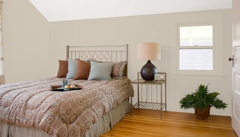
Sherwin William’s accessible beige bedrooms:
The color you should paint in your bedroom relies most on your bedroom furniture, especially your bed, closet and the dressing table which are most likely to be the same color as each other. Accessible Beige is made for bedroom walls with pastel-colored furniture as it is itself a subtle color. However, it is also a good choice for a bedroom with wooden floors and dark furniture. Combining some other colors with Accessible Beige is another great idea to give the walls a perfect look.
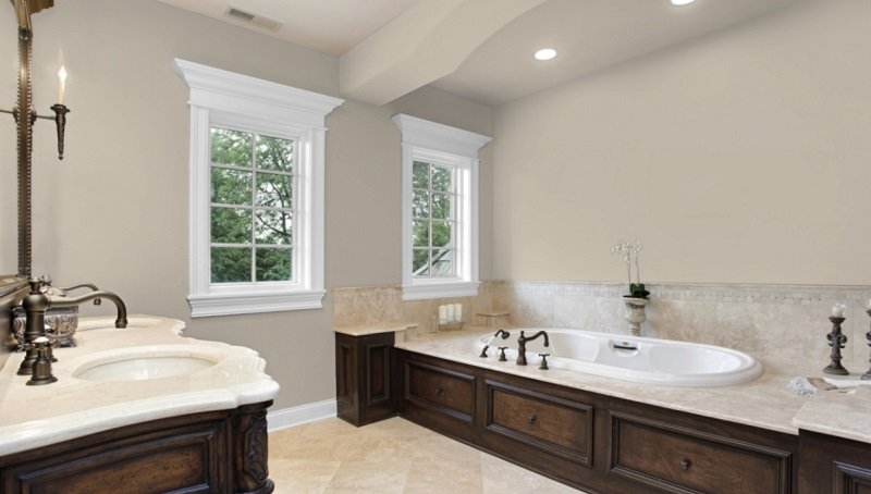
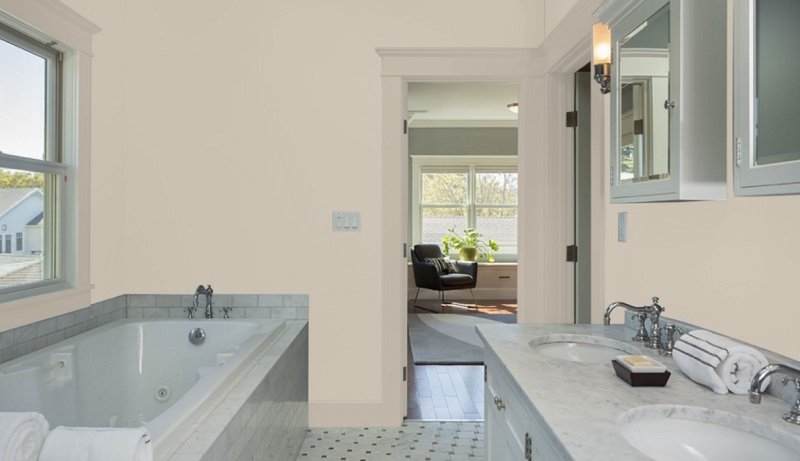
Sherwin William’s accessible beige bathroom:
Choosing the right wall paint in a bathroom is as significant as choosing it for any other wall of your house. Usually, the bathroom furniture is made of light colors to create a comfortable feel, and Accessible Beige is a neutral color, meaning it can both contrast or match with the color of the tiling, counter, and the furniture. There aren’t many windows in a bathroom; hence, painting your walls with a soft and upbeat shade like Beige Gray can solve the problem.
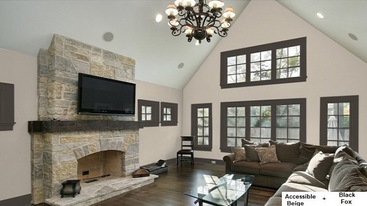
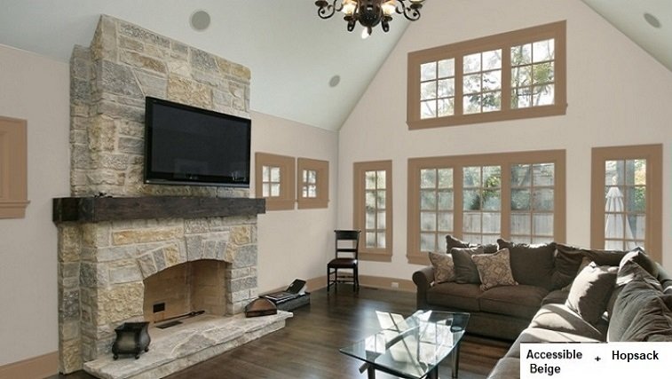
Sherwin William’s Accessible Beige Living room:
Accessible Beige and Balanced Beige are my absolute favorite. Use Virtual Taupe on an accent wall because it is darker and would complement your other walls painted with a much lighter but similar shade, Accessible Beige. Then, add a few living room commodities, which won’t be difficult to find, considering that the walls are colored with such a neutral color. Even going with dark and radiant furniture will work just fine in the living room.
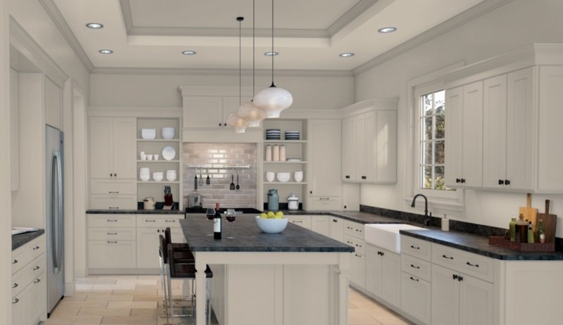
Sherwin William’s Accessible beige kitchen:
Accessible Beige is a vital shade to use as the main color in your home. SW Rainwash, which is another color designated to paint walls like that of kitchens, can be used along with Accessible Beige as they blend perfectly. With wheat brown kitchen island or white coconut counters in the kitchen, Sherwin William’s Rainwash or Accessible Beige is a must to give your kitchen an elite semblance. With most floors being wooden these days, you need something more than just Accessible Beige, and that’s Gauntlet Gray, a bold shade for kitchen islands contrasting with the lighter walls painted with Accessible Beige.
Sherwin William’s accessible beige cabinets:
Because of the subtle, one-toned nature, Accessible Beige can be used by many for cabinets and closets as these have walls not needing stark and contrasting colors. A subtle color can give the prim look of it being more spacious and not hinder excessive usage. It would also be neutral to go with any other outer layer or any theme layered in the room itself. The added effect would be to make the closet or cabinet look just that bit more presentable.
Sherwin William’s Accessible foyer:
Even though the furnishing is a little conventional, that is the specialty of this color. It settles with every style regardless of the type of decor. A list of colors that you can use with Accessible Beige includes Web Gray, CityScape, and Mineral Scapes. They all are different tones of gray, each having its nature, and they go incredibly with Accessible Beige. What makes a foyer from an old school plain entrance to a major upgrade, modern style gray-toned and lean walkway is some amazing choice of plain-toned colors like accessible gray. The most memorable moments framed and hung or put on a wooden oak table and perfect afternoon hour befalling on that paint, making your ordinary house a welcoming home to positivity colors.
Sherwin William’s Accessible Beige Sunroom: What a dreamy midsummer day if you could sit all by yourself in your sunroom with a refreshing glass. With mint margarita and relax as the sunlight beams through, radiating the warmth in your room painted with that Accessible Beige. The transparent screens in the accessible Beige will surely protect you from the scorching rays though so you don’t get sunburnt! The comfort with the pleasure going hand in hand is this good deal of colors on the wall.
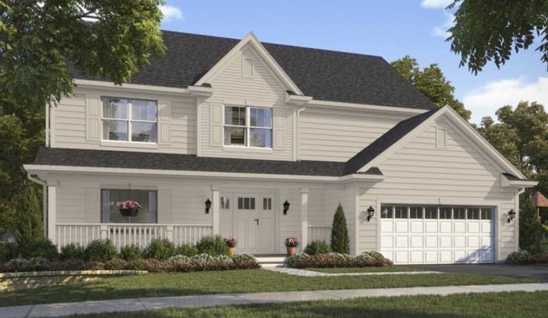
Sherwin William’s Accessible Beige exterior:
Colors preferred for the exterior of a house mostly gray, whites, browns, and exceptional some shades of green. Accessible Beige, having an undertone of gray, without being too golden or yellow, is an ideal paint for the exterior of your house, giving your house a classy appearance. Accessible Beige develops an off-white shade when sunlight falls upon an area coated with it, adding to the elegance of the exterior and the list of pros of using Sherwin William’s Accessible Beige.
What are the undertones of Accessible Beige:
If you’re looking for the undertones of paint, meaning you are trying to recognize the tones by looking at it from different positions, you will need a paint chip. Since, Accessible Beige has a lot of brown, you will see a lot of it on the paint chip. To find the undertone, look carefully at the chip where there is the most concentrated tone, and you will be able to see the correct undertones. You are basically looking at a beige with a vast amount of gray when viewing the Accessible Beige on the paint chip. Most of the old-school beige paint colors display too much yellow or orange but Accessible Beige has a pacific quirk to it unlike those colors, inclining to the side of the greys. However, it isn’t too gray, which is why it can be classified as greige, meaning between gray and Beige.
After being combined with a couple of subdued shades, Accessible Beige settles everything perfectly. It develops a more greenish shade under the lights, but it looks tranquil. However, if you don’t like it, make sure to try a small area to check how it looks and whether you like it before deciding to paint a large wall. Also, if you have the windows facing a garden area outside the room, the walls would look great with a paint with an underlying green shade.
Best trim for Sherwin William’s Accessible Beige:
Read below to learn about the Best trim for Sherwin William’s Accessible Beige
What is the best white trim color with Accessible Beige:
The best kind of white to combine SW Accessible Beige is Sherwin William’s pure white. The paint has a cozy texture without being overly bright white or too subdued, just the accurate.
If your objective is to find a trim color but one without undertones such as purple, yellow, or pink, it best to choose bright crisp white like, for example, Extra White. It blends perfectly with Accessible Beige and gives your bathroom cabinetry it’s fitting to look. It wouldn’t even steal the comfort of your zone.
For a kitchen with Kilim Beige, as it’s trim color, a genuine suggestion would be to apply paints like Tony Taupe or Stone Lion because they are darker, so it won’t show too many stains. However, if you have coconut white granite countertops and white lights around your kitchen then Accessible Beige is the better color. It will give a classier look because it’s a gray undertone, which will match with the white of the countertops. Don’t hesitate to check other similar colors by grabbing a sample and holding it next to the counter, cabinets, and backsplash in your kitchen.
Warm or cool, what is accessible, Beige?
The word ‘greige’ is a mixture of Gray and Beige; just like the paint, Accessible Beige is a mix of two colors: Gray and Beige. Since it would be unfair to refer Accessible Beige as just gray or just beige, the
Term ‘Greige’ has been derived. It is a unique stir of two very neutral colors. Thus, the combination has created yet another neutral color to any walls in the interior or exterior of your house.
If the ‘Beige’ in the Accessible Beige is bothering you, you should know that it is not a beige. The acronym ‘Greige’ is used for it because it is neither too Beige nor too gray, just the mediocre, which is why it’s in the list of greige. The undertone is what can be called taupe because there isn’t any yellow or golden in it, giving it a mellow essence.
Using ‘Accessible Beige’ as the main color in their house is an all-time favorite of most people predominantly because it has the precise degree of its pigment, giving it it’s a neutral tendency. Moreover, it can blend with many colors seamlessly. It is why it is perfect for literally all parts of a home from the foyer to the master bedroom of your home.
What colors go with Sherwin William’s accessible Beige:
- Sherwin William’s sea salt
- Sherwin William’s Pure White
- Sherwin William’s Repose Gray
- Sherwin William’s agreeable gray
- Sherwin William’s Alabaster
- Sherwin William’s Naval
- SW Angelic
- SW Rock Candy
- SW aesthetic White
What paint do colors look good with accessible Beige?
Having mute undertones allows Accessible Beige to be adaptive. Here is a list of suggestions of the colors that are itself neutral and would improve the look of your wall when combined with ‘Accessible Beige’:
- The Warm grays which are darker than Accessive Beige
- The cooler grays which are darker than Accessive Beige
- It will also give a chic look with the cream paints but only if they are moderately yellow or orange
- The earth-toned colors with some gray or brown in them colors look fantastic too.
Sherwin William’s Balanced Beige is a similar but lighter kind of Accessible Beige and is another substantial shade of paint for your walls.
What colors don’t look good with Accessible Beige:
Some colors do not go too nicely with Accessible Beige. These gray other greige paint colors with the same LRV as the accessible Beige or higher than it. Also, it doesn’t pair up with those shades which do not have gray or brown undertones. Since it belongs to the class of neutrals, it looks best with other paints in the class.
Accessible Beige in a south-facing room:
Due to its light undertones, Accessible Beige can be expected to reveal the soft and subtle nature with a little gray and green. The benefit is that the rooms wouldn’t heat up too much as a color so dim does not radiate heat like the darker and bolder ones, which is why it is always best to go for shades like Accessible Beige and Sea Salt to paint the walls of a south-facing room.
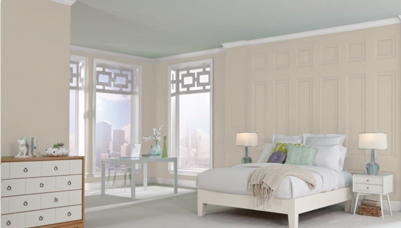
Accessible Beige in a north-facing room:
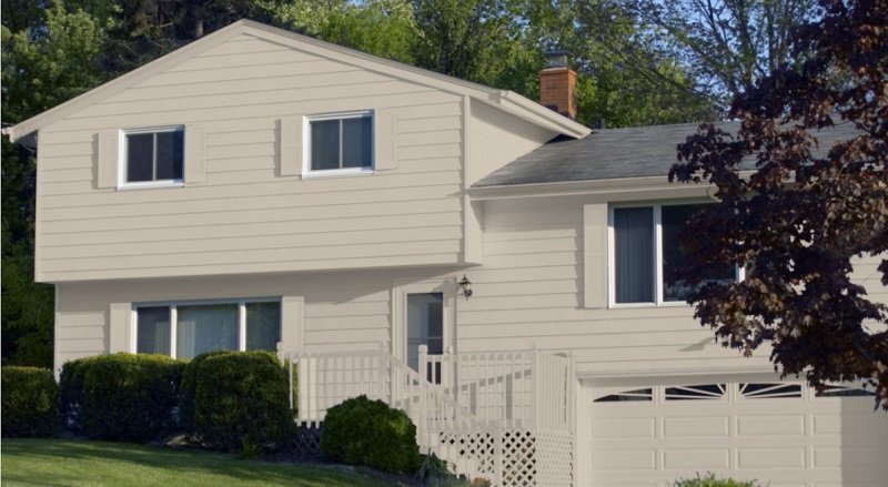
Contrary to its preservation nature in a south-facing room, it implies a grayish tone in a north-facing room. Client preferring the gray tones usually go for it even though it’s beige just because they think that Accessible Beige displays the precise degree of gray in their north-facing rooms, creating a vibe they are accustomed to. The picture added below shows how Accessible Beige has procured a gray shade that contrasts stunningly with the wooden trim.
Accessible Beige in a room with NO(or little) natural light:
One of the favorite neutral among the neutrals of Sherwin William’s is Accessible Beige. However, it certainly relies on the color you have your tiles in. Accessible Beige would not be suitable for a room with yellowish or golden hints in their tile color. On the other hand, tiles with gray and taupe tones similar to the undertones of Accessible Beige will go with the walls painted in the same color i.e., Accessible Beige
If you are a lover of Accessible Beige and have renovated your kitchen, looking for a shade to use for your backsplash, Accessible Beige is an incredible option. Especially with the marble floor, it would give your place a dreamy look something you would not want to miss. It is also applicable to your bathrooms with granite tubs and marble floors and will surely look too good.
Sherwin William’s Accessible Beige IRV
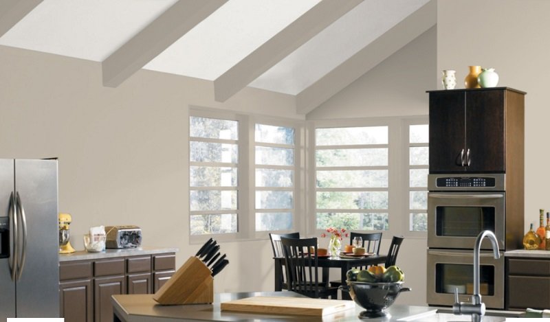
Having an IRV of 58 means Accessible Beige is a shade that is a little darker than neutral. LRV is an acronym for Light Reflectance Value, which is defined as how much light the paint color reflects off its surface. The higher LRV a paint color has, the lighter it will be. So, Accessible Beige having an IRV of 58, can be considered as a neutral but dark neutral paint color. The LRV of Accessible Beige is just about right for it to add glamour to the place alongside keeping things simple and cool. For an IRV of 58, Accessible Beige is exceptionally lighter, although not too light. In the picture above, Accessible Beige can conserve when the sun isn’t shining too bright on it, unlike where there is too much sunlight falling onto it.
Comparison with other colors:
Agreeable gray vs. Accessible Beige:

The two colors may look very similar, but placing them beside each other will make you spot the differences. The most remarkable distinguishing feature between the two looks like is their different undertones. Agreeable gray has undertone similar to purple whereas, Accessible Beige has an underlying taupe quality in it. Nonetheless, they both are good enough to use in any part of the house.
LRV compared:
- Accessible Beige LRV:58
- Agreeable Gray LRV:60
Sea Salt vs. Accessible Beige:

The two colors are different, but putting them together shows how well do they contrast with each other. They are perfect shades to combine in the paint of your living room especially living rooms with dark wood furniture and bedrooms with carpeted flooring and balconies.
LRV compared:
- Accessible Beige:58
- Sea Salt:64
Accessible Beige vs. Alabaster:

A shade of white, Alabaster is a very wisely chosen color for doors and frames. It would make the doors, and the walls look great together if painted Accessible Beige. A doorway with Alabaster doors and frames and an appealing touch of Accessible Beige painted walls would surely be the epitome of a welcoming household.
LRV Compared:
- Accessible Beige:58
- Alabaster:82
Alpaca vs. Accessible Beige:

Alpaca includes the list of neutral colors. It is yet another shade of gray and would look great in rooms with white wall lamps. It has similar undertones with that of the Accessible Beige.
Balanced Beige vs. Accessible Beige:

Looking at them together would tell you two colors have different undertones. Balanced Beige leans to a brown shade, thus looking much darker whereas Accessible Beige has gray undertones. As mentioned below, their respective LRVs support it as Accessible Beige has a much higher LRV than the Balanced Beige.
LRV Compared
- Accessible Beige:58
- Balanced Beige:46
Modern Gray vs. Accessible Beige:

The modern color Gray more so the agreeable gray is not much different from Accessible Beige as far as undertones and overall effects are concerned. The modern gray look would be a bit more dull and sullen while the Beige would add that hinge of color and required warmth.
Perfect Greige vs. Accessible Beige:

Together, these colors would be the perfect neutral and cool combo. And could help to lighten and warming up the effect in a room.
LRV Compared:
- Accessible Beige: 58
- Perfect Greige: 62
Revere Pewter vs. Accessible Beige:

Almost the same colors differentiated by a different undertone. These colors look exact copies, but Revere Pewter has an inkling of green, whereas Accessible Beige is a shade of gray, making them the same yet very different colors.
LRV compared:
- Revere Pewter: 55.51
- Accessible Beige: 58
Balboa Mist vs. Accessible Beige:

It is light versus dark contrast and works for a good theme all over the house. Balboa mist has a lavender hue, and a purple undertone while Accessible Beige has a gray undertone, thus, perfectly binding together and looking like the best combinations.
LRV Compared:
- Accessible Beige: 58
- Balboa Mist: 67.37
Natural Tan vs. Accessible Beige:

Like their LRVs, they are pretty much the same, and it requires a keen eye to distinguish between them. Unlike the Accessible Beige, Natural Tan is more of a tan shade than a gray shade, which is particularly the only thing that makes them different.
LRV Compared:
- Natural Tan:60
- Accessible Beige:58
Realist beige vs. Accessible Beige:

Know at times as natural woods; these colors are brilliant for bringing out the true Beige and blending in with each other. However, the former is a creamer, richer version of accessible Beige, and would work best with wood.
LRV Compared:
- Accessible Beige: 58
- Realist Beige: 59
Shiitake vs. Accessible Beige:

With a green undertone, shitake is not the color to blend in perfectly with accessible Beige as it has cooler effects in the back. However, the Shiitake would look best with silver mist, but Accessible Beige is good with alabaster shades.
LRV Compared:
- Accessible Beige: 58
- Shiitake: 52.45
Wool Skein vs. Accessible Beige:

Accessible Beige has a pinkish gue that is not detectable with the perfect lighting while wool skein is a cooler and grayer color than Accessible Beige itself and its undertones.
LRV Compared:
- Accessible Beige: 58
- Wool Skein: 63
Final thoughts:
Accessible Beige can truly be used in a variety of ways in a variety of places. If you have the slightest doubts if Accessible beige is your color or not, all you have to do is buy a peel and stick paint sample and do some testing. They are available for you to take a trial-sized amount of paint to help you make the right choice, saving you a precious amount of time and money while making your experience a great one.