Papa John’s Is Totally Changing Its Logo And Stores
Papa John's has announced plans to change is logo and stores.
This article is more than 2 years old
Over the past decade or so, many fast-food chains have been giving both their stores and logos some much-needed facelifts. Chains like Taco Bell and McDonald’s have redesigned their restaurants to have a sleeker more modern minimalist look. Dunkin’ Donuts now only goes by Dunkin’ and has plans to remodel its existing locations, as well. Papa John’s Pizza is now hopping on the revamp bandwagon. CNN announced that the pizza chain revealed its plans to refresh its logo as well as makeover its stores.
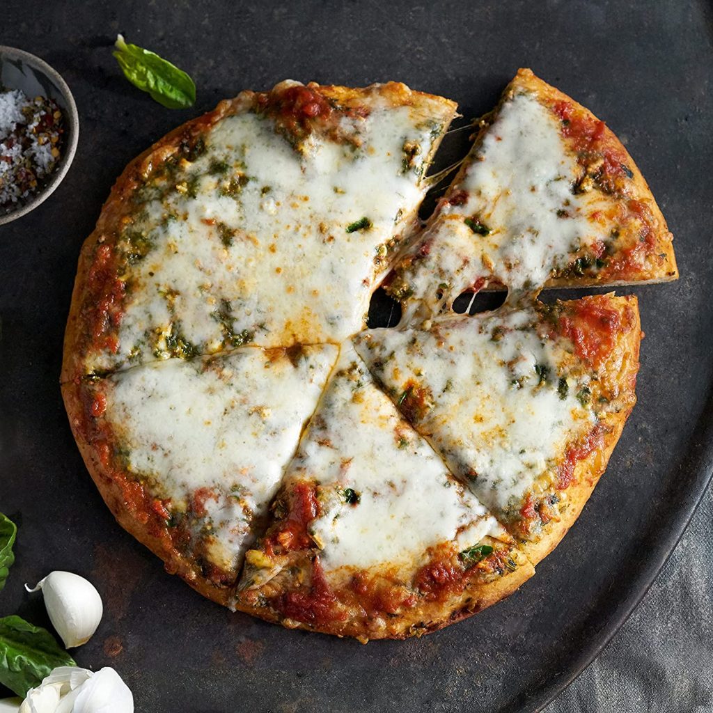
The new logo design drops the world pizza, omits the green backdrop of the original design, and nixes the possessive apostrophe from “Papa John’s.” The new logo is simpler and will now feature all capital bright red letters that read as described above. The logo redo comes just three years after Papa John’s launched an updated ad campaign in a public relations move to separate itself from controversies sparked by the chain’s former CEO John Schnatter.
Max Wetzel, Papa John’s chief commercial officer, said the reason that they’ve decided to implement the changes is so that they can more accurately reflect the vision of the brand. Most people are familiar with the slogan, “Better ingredients, better pizza, Papa John’s” and with the logo refresh as well as the store redesigns the chain hopes to emphasize that philosophy to an even greater degree.
The stores will now feature a much more natural color palette reminiscent of the fresh (farm-to-table-like) ingredients that Papa John’s uses to make its pizzas. Wetzel explained that they chose colors like basil-green and tomato-red as well as an off-white dough color. He even pointed out that the way Papa John’s is now written in the logo is meant to be representative of their super stretchy handmade pizza dough. The chain is also adding quality of life features to the functionality of their stores so as to make it easier for one to just grab their food and go, which is right in line with the fast-paced lifestyles of many a person. One significant upgrade that they are planning to implement is the ability for a customer to perform their own self-service checkout. They’ll be able to grab their order from the in-store pickup counter and head over to a machine, similar to what one would find in many grocery stores, and then quickly pay and be on their way.
The logic that Papa John’s has used for its revamp/rebrand falls right in line with both industry and consumer trends. In recent years many people are becoming more cognizant of their health as well as becoming increasingly aware of what goes into their food. In a similar vein as Papa John’s, Burger King recently committed to removing any artificial ingredients from their menu items.
Amanda Clark, chief development officer at Papa John’s detailed that going forward while all of its new stores that are planned to be built by the end of the year will feature the updated logo and look, that the company expects to gradually convert and update its existing locations. She referred to it as a “Soft conversion.”