M&Ms Characters Have Been Redesigned For Inclusivity Reasons, See The New Look
M&Ms has entirely revamped its lineup of popular characters with all-news looks.
This article is more than 2 years old
Rebranding, redesigning, and refreshing tired brands is all the rage, as of late. In a sweeping maneuver, Coca-Cola changed up the labeling for each and every one of its core products. A slew of other companies across the nation have also been taking steps to reinvigorate their brands, products, and logos. M&M’s are the latest product to get an overhaul, well its characters are, that is. According to CNN, Mars Wrigley, the parent company of M&M’s just unveiled all-new designs for each of its iconic M&M’s personalities.
A quick visit to the M&M’s website greets you with the character’s front and center and ready to reintroduce themselves to the world. The changes, while subtle, are indicative of M&M’s new marketing strategy to make the brand more modern as well as to promote inclusivity while weeding out archaic stereotypes. Take a look below to see if you can spot all the differences in the new character designs…
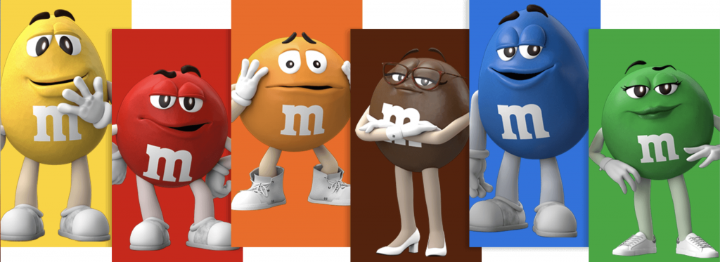
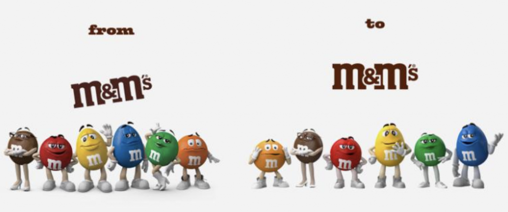
Here are the originals for comparison…
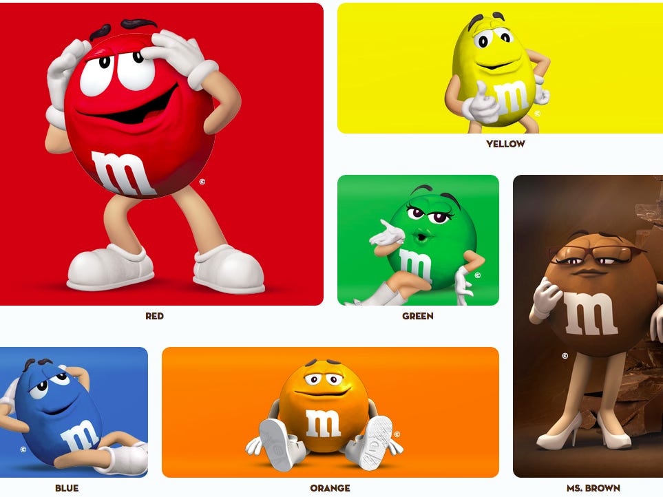
There are tiny tweaks noticeable on each character, however, what stands out the most are the changes M&M’s made to the character’s shoes. The shoes are not as “cartoony.” Many have been scaled down in size and have had laces added to them. Perhaps the biggest change, and one that is reflective of M&M’s new advertising angle, is that Green’s knee-high boots have been swapped out for Converse-like sneakers. Have a look at a side by side comparison photo below…
Anton Vincent, the president of Mars Wrigley North America, commented that the soft redesigns of the M&M’s characters are meant to communicate the company’s new messaging and he believes people will really pick up on that cue. David Camp, the co-founder and managing partner of Metaforce, echoed Vincent’s logic. He explained that even tiny shifts help to keep brands relevant. Camp also noted that it’s important for every brand to “continuously reinvent itself.”
Speaking of the importance of subtleties and reinvention, in addition to the M&Ms characters, the logo has also been altered just ever so slightly. It has gone from being presented on its side to being positioned straight up. The former’s angled appearance evoked a somewhat playful aura. However, the new positioning screams confidence, almost as if M&M’s are trying to communicate that they are stomping boldly into the future.

Moreover, the president of Mars Wrigley also asserted that the company is committed to making the characters’s a more integral part of the brand than ever before. He explained that this strategy is so that consumers can more easily align and connect with the brand on a deeper level. “It gives us a good platform to talk about the whole idea around belonging,” Vincent said. M&M’s plans to bring the female characters, in particular, to the forefront.
Vincent went on to detail that the two girls, Green and Brown, will have more integral roles in ads and product placement. The decision to bring Green and Brown more into focus could prove to be an advantageous strategy for the brand, especially since M&M’s ads have long been dominated by Red & Yellow’s male character dynamic. The new changes are launching this week and new product packaging will begin hitting store shelves throughout the year.