Spotify Pie Chart: How To See Your Music Tastes In One Place
The Spotify Pie Chart is a complete visual representation of your musical tastes.
This article is more than 2 years old
Technically, Spotify Pie Chart is not a Spotify creation. Instead, Darren Huang, a student from UCLA, created the app.
TO CREATE YOURS START BY LOGGING IN TO THIS WEBSITE
Like many of the Spotify add-ons such as Receiptify or Spotify Color Palette or even Spotify Picture Frame, Spotify Pie Chart is very easy to use.
The first thing you will need to know is that if you are going to use Huang’s creation, you will have to sign into your Spotify account so your music listening data can be analyzed. If this is something you aren’t excited about doing (logging in), then you may want to take a pass on the Spotify Pie Chart.
Now, if you are comfortable with sharing your data, then the process is very simple. First, you head to Huang’s Spotify Pie Chart website. Once there, you will be greeted with a very loud (visually) welcome – SPOTIFY PIE. Bake Your Monthly Genre Pie – catchy, huh?
You will then see the “Login to Spotify” button that you will click on and log in to your account. You will then be moved to another page that tells you just what Spotify Pie Chart will have access to. Again, if you aren’t comfortable with this, back out. Moving forward, you will simply hit the AGREE button. Once you do this, it won’t take but a few moments for the magic to happen.
Spotify Pie Chart Is A Complete Visual Of Your Musical Tastes
What makes the Spotify Pie Chart unique and truly something worth experiencing, is that the pie chart is a complete visual representation of your musical tastes.
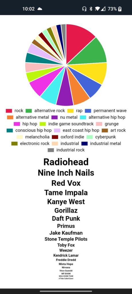
With the Spotify Pie Chart, your music habits are shown to you in a nice big pie chart, just like the one you may have seen a time or two in school. Depending on how much music you listen to, how many different artists, your Pie could resemble a pizza pie with a few large slices, or a pizza pie cut up into many teeny, thin slices. One more thing, it will be a colorful creation.
Your music will be split and identified by multiple colors and will also include a key underneath your pie chart that explains to you what each color represents. Underneath this, you will also see the names of the music artists you listen to most. They will be ranked in order, top to bottom, with the font getting smaller by each artist going from your most popular to least.
YOUR PIE WILL HAVE GENRES YOU’VE NEVER HEARD OF BEFORE
Another cool feature of this Spotify Pie Chart is how Huang has set up the music genres. You have the old standbys, rock, pop, country, etc., but you will also see genres you’ve either never heard before or never considered.
Some of these eclectic genres include country dawn, red dirt, deep new wave, mellow gold, Canadian metalcore, post-grunge, British soul, and nu-metal. You will see exactly what we mean when you create your own Spotify Pie Chart.
You can see where the popularity of this app comes from. Yes, Spotify Wrapped is a great feature that Spotify offers its millions and millions of users, but again, it only comes once a year like Christmas. With Huang’s Spotify Pie Chart, you can check out your listening habits each and every month.
So, let’s quickly address the elephant in the room. Some of you, though we don’t know why, prefer to use Apple Music with Apple iPhones or other Apple devices. Unfortunately, the pie chart only works for Spotify users, so if you were hoping you could create an Apple Pie Chart (get it?) with Huang’s app, you are sadly SOL.
SHARE YOUR SPOTIFY PIE CHART USING SCREENSHOTS
For the most part, apps such as the Spotify Pie Chart are created for one reason and one reason only and that is so you can show off to your family, friends, and followers just how strange your music tastes are. We know some of you listen to some truly whack material and letting people know just how strange your listening habits are, makes you a happy person.
The Chart doesn’t have an official way to share the result, so most people simply do this by screenshotting their pie. From there, they simply post it to whatever social media post they prefer.
We know many of you social media junkies will be posting on Facebook, Snap Chat, TikTok, Instagram, and Twitter, all at the same time.
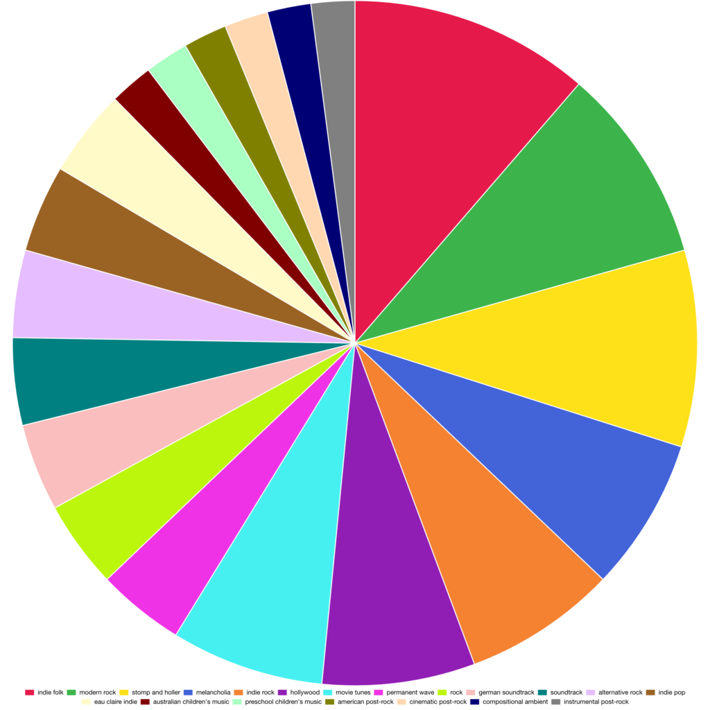
Below is a sample screenshot…
As you can see, we were not wrong about the Spotify Pie Charts being big and colorful. Huang has included genres that you’ve probably never heard of and the addition of your favorite artists listed as most listened to from top to bottom in a shrinking font is a brilliant move.
Have fun creating and sharing your own.
THE SPOTIFY PIE CHART IS LIKE SPOTIFY WRAPPED, BUT MORE FREQUENTLY UPDATED
The Spotify Pie Chart is basically for those who love Spotify Wrapped but don’t have the patience to wait around for the once-a-year (typically in December) event.
For those of you who aren’t aware of what Spotify Wrapped is all about, it is a virtual marketing campaign created by Spotify that allows users to view their platform activity over the past year. It started in 2015 to great fanfare and has become very popular on social media for users who love to share their listening habit data with others.
Historically, Spotify Wrapped includes the five musicians a user has listened to the most, the songs users have listened to the most, and the user’s favorite music genre. If you so happen to be a producer of Spotify content, Spotify Wrapped also has a version for them that compiles the number of times their content has been streamed.
The problem with this event is that Spotify does it but once a year. Enter Spotify Pie Chart.
This Spotify tool does exactly what Spotify Wrapped does, only Huang’s creation can be updated more often. Just how does it work?