When maps were made to persuade, not inform
Maps are more than mere directional tools; they’re a canvas of persuasion, drawing the viewer into a narrative crafted by the cartographer. In the world of persuasive cartography, maps are designed not just to inform but to influence opinions and decisions.
This art form, which intertwines geography with rhetoric, has been shaping worldviews for centuries. By examining the elements of persuasive cartography, we gain insight into how maps have been used to communicate complex messages.
A Brief History of Mapmaking
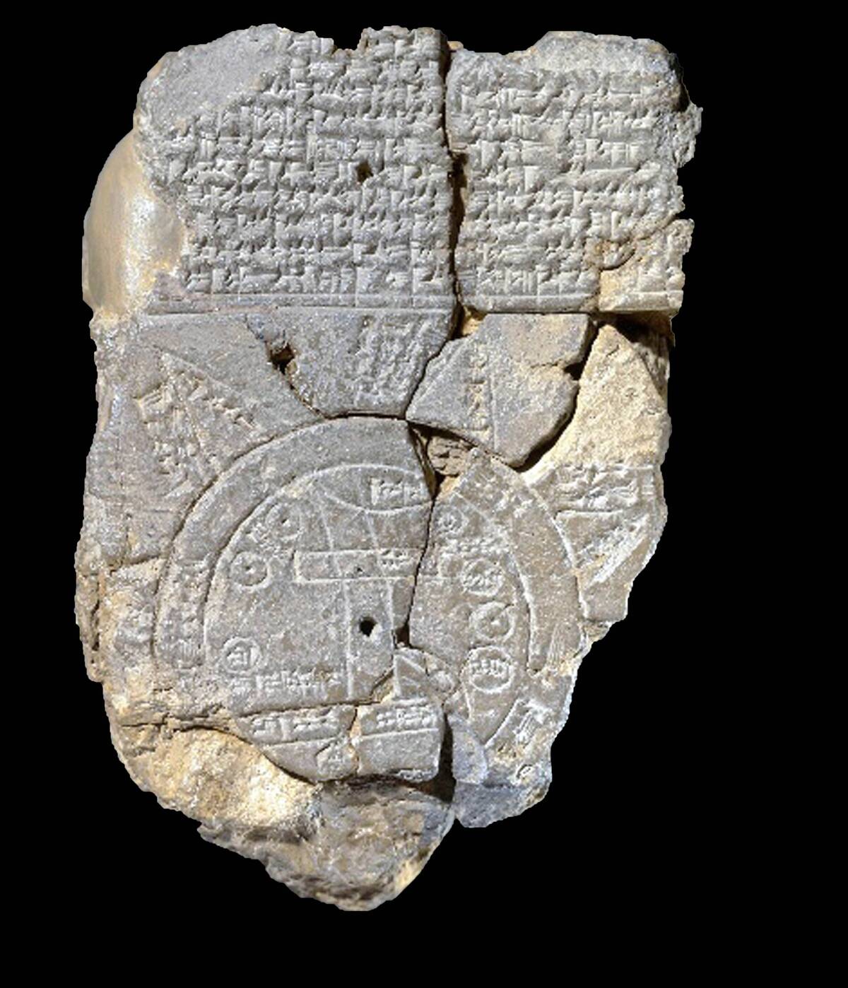
The art of mapmaking traces back to ancient civilizations, with the Babylonians creating some of the earliest known maps on clay tablets around 2300 B.C. As societies evolved, so did the complexity and purpose of maps.
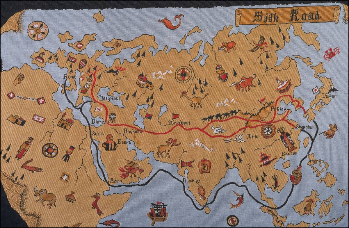
In the Middle Ages, European maps often depicted a religious worldview, placing Jerusalem at the center. By the Age of Exploration, maps became essential tools for navigation and trade, reflecting the expanding horizons and ambitions of empires.
The Purpose Behind Maps: More Than Just Directions
While maps guide us from point A to point B, their purposes extend far beyond navigation. They serve as tools for storytelling, illustrating political boundaries, cultural regions, and historical events.
Maps can convey power dynamics, economic conditions, and even social hierarchies. Whether used in a classroom to teach geography or in a boardroom to strategize market expansion, maps are versatile instruments that communicate complex ideas in a digestible format.
Cartography as a Tool for Propaganda
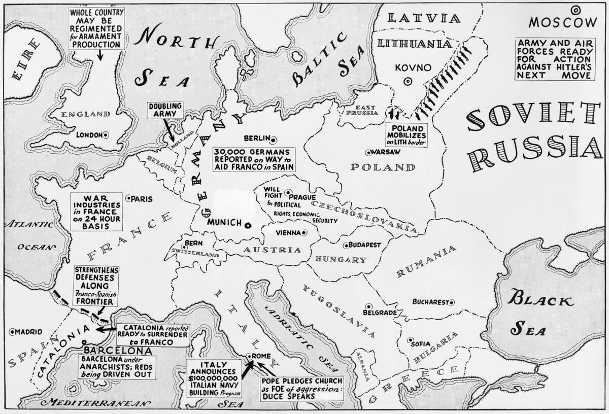
Throughout history, maps have been wielded as tools of propaganda, subtly influencing perceptions and opinions. During World War II, both the Allies and Axis powers used maps to emphasize their strengths and the enemy’s weaknesses, often exaggerating territorial gains or minimizing losses.
Such maps were not just informative but persuasive, designed to boost morale and justify military strategies. This strategic use of cartography illustrates the power of visual storytelling in shaping public sentiment.
Political Agendas in Historical Maps
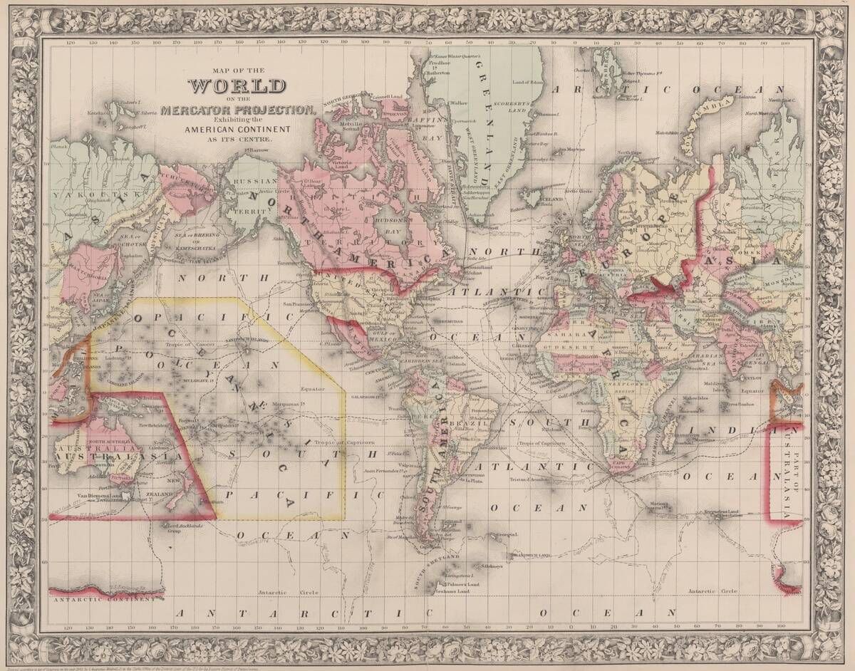
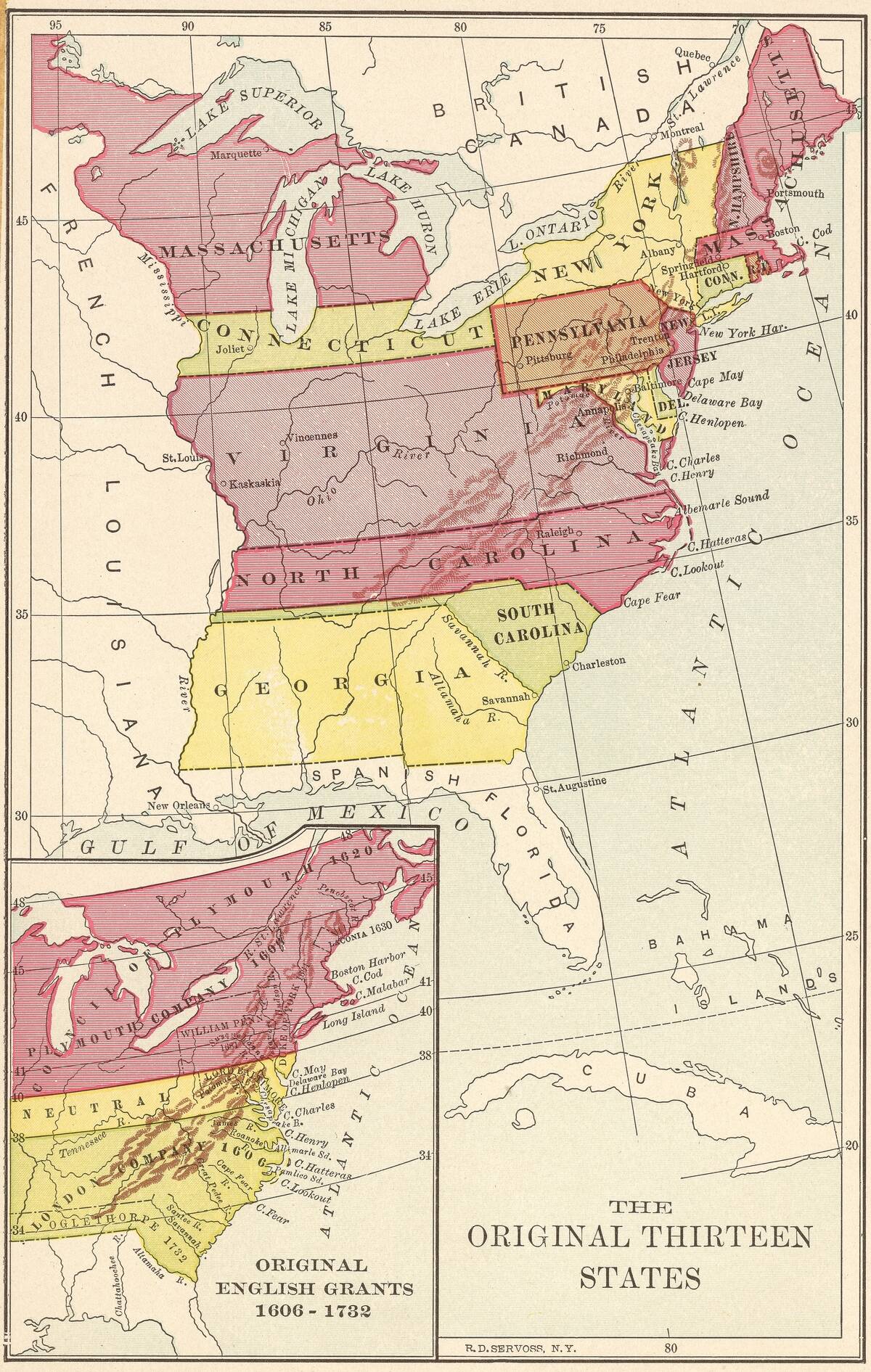
Historically, maps have been crafted to serve political agendas, often depicting territorial claims and borders in ways that favor the mapmaker’s interests. For instance, the Mercator projection, developed in the 16th century, exaggerated the size of European countries compared to those near the equator, subtly reinforcing colonial supremacy.
By manipulating scale and perspective, cartographers could influence viewers’ perceptions of geopolitical power and control, underscoring the map’s role as a political tool.
The Role of Maps in Colonization
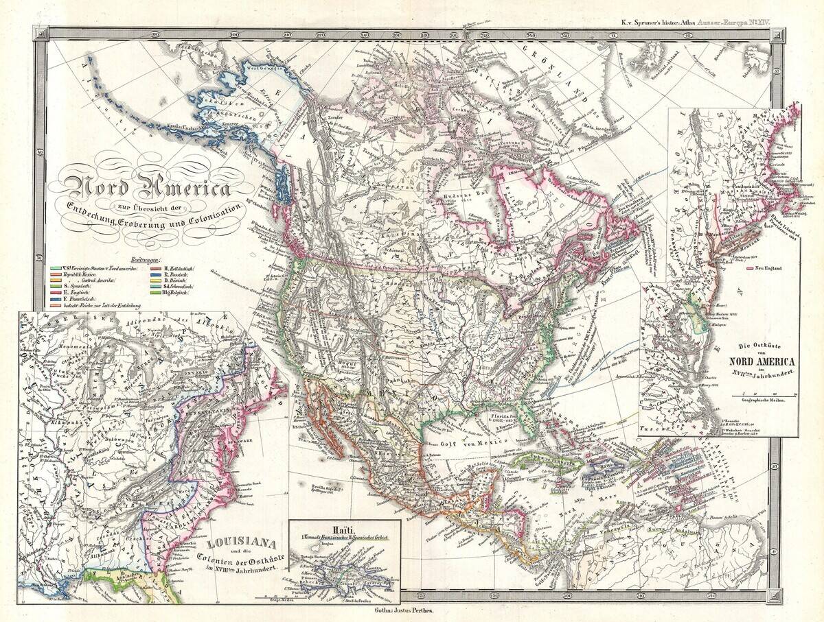
Maps played a pivotal role in the era of colonization, offering European powers a means to document and legitimize their territorial acquisitions. As explorers charted new lands, maps were used to lay claim to these territories, often disregarding the presence and rights of indigenous populations.
The depiction of these lands as ’empty’ or ‘unclaimed’ facilitated the narrative of exploration and conquest, masking the complex realities of colonization. Thus, maps became instruments of imperial ambition and control.
Maps as Instruments of War
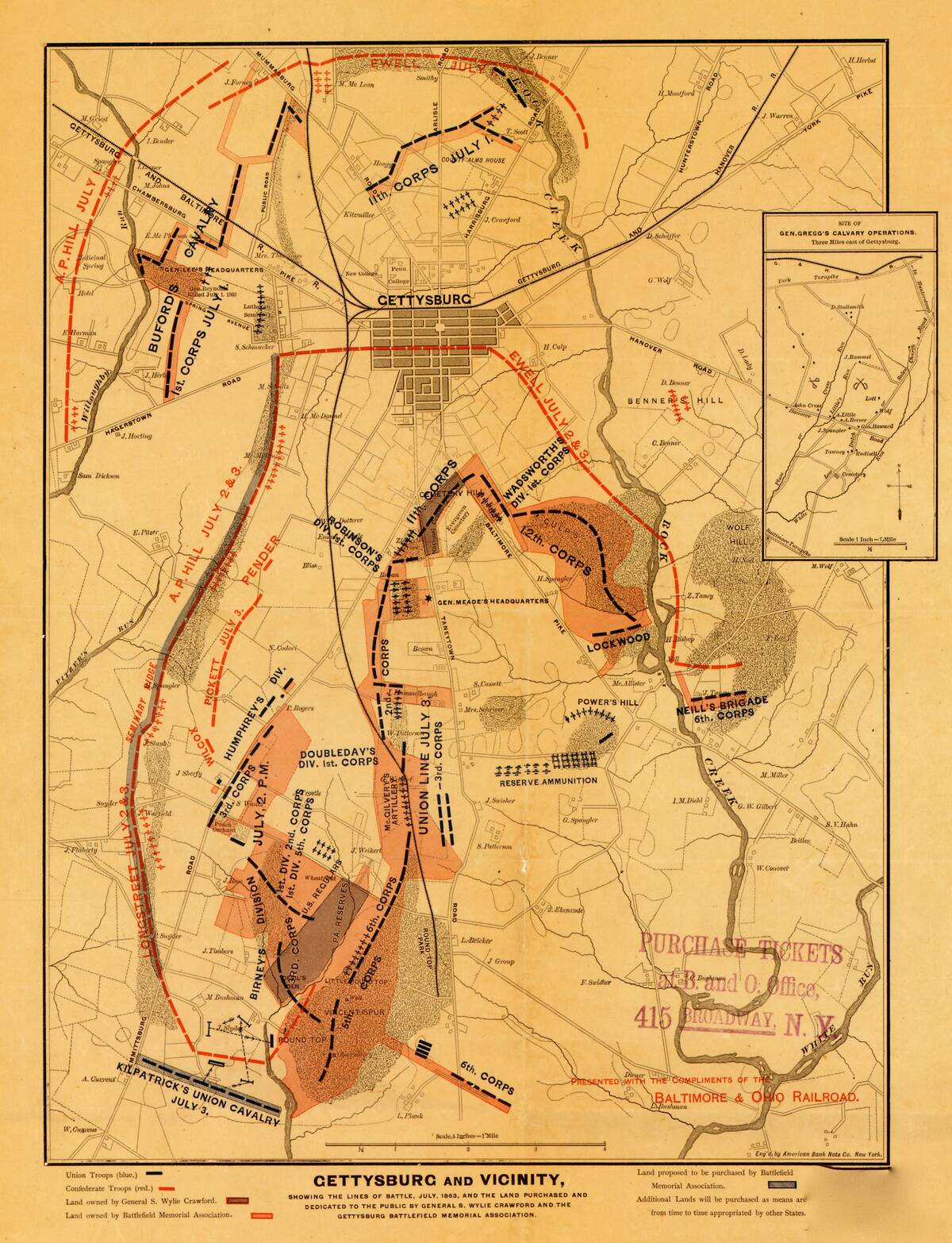
In times of war, maps are indispensable tools for planning and executing military strategies. During the American Civil War, maps were crucial for both Union and Confederate forces, providing detailed information about terrain, fortifications, and troop movements.
The ability to read and interpret these maps could mean the difference between victory and defeat. In this context, maps were not just representations of land but tactical assets that could influence the course of history.
The Influence of Religion on Map Design
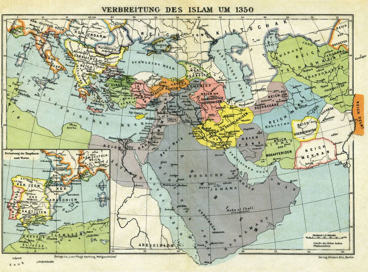
Religion has historically influenced map design, often placing spiritual centers at the heart of the world. Medieval European maps, known as mappae mundi, frequently positioned Jerusalem at the center, reflecting the Christian worldview.
Similarly, Islamic maps from the medieval period often oriented the world with Mecca at the center. These religiously-influenced maps served not only as navigational aids but as visual manifestations of spiritual beliefs, guiding both pilgrims and the faithful in their journeys.
Mapping the Unknown: Filling in the Blanks with Imagination
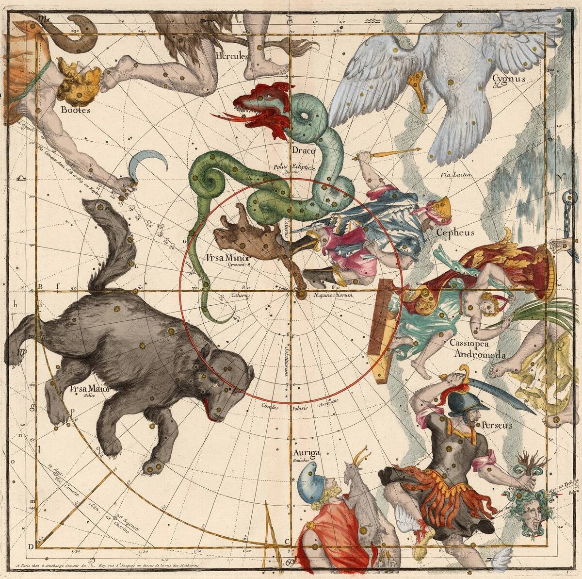
In times when parts of the world remained unexplored, cartographers often filled in the blanks with imaginative details. The phrase “Here be dragons” is famously associated with medieval maps, where uncharted territories were marked with mythical creatures.
This practice not only sparked curiosity and adventure but also cautioned explorers about the unknown. These imaginative embellishments reflected the human desire to make sense of the world, even when faced with vast expanses of mystery.
The Use of Cartographic Symbols to Sway Opinions
Cartographic symbols are powerful tools that can subtly influence opinions and convey messages beyond the map’s surface. Symbols such as arrows, colors, and icons can highlight connections, emphasize certain areas, or downplay others.
During the Cold War, maps used stark colors and bold symbols to depict the ideological divide between East and West, reinforcing the notion of a world split by opposing forces. These symbols helped craft a narrative that was as persuasive as it was informative.
The Role of Color and Design in Persuasive Maps
Color and design are critical elements in the creation of persuasive maps, influencing how information is perceived and interpreted. Warm colors such as red and orange are often used to highlight areas of conflict or danger, while cooler tones like blue and green can suggest calmness or neutrality.
The strategic use of color can evoke emotional responses, guiding the viewer’s eye and reinforcing the map’s intended message. Design choices, from font to layout, further enhance the map’s persuasive power.
Maps as a Reflection of Cultural Beliefs
Maps often mirror the cultural beliefs and values of the societies that produce them. For example, ancient Chinese maps frequently placed China at the center of the world, reflecting the Middle Kingdom’s view of itself as the world’s focal point.
Similarly, medieval European maps depicted a Christian-centric universe. These cultural perspectives were embedded in the map’s design, offering insight into how different societies viewed their place in the world and their relationships with neighboring regions.
Notable Examples of Persuasive Maps Through History
Throughout history, numerous maps have stood out for their persuasive impact. The “Carte de France” by Cassini in the 18th century meticulously detailed the French landscape, emphasizing the nation’s unity and strength.
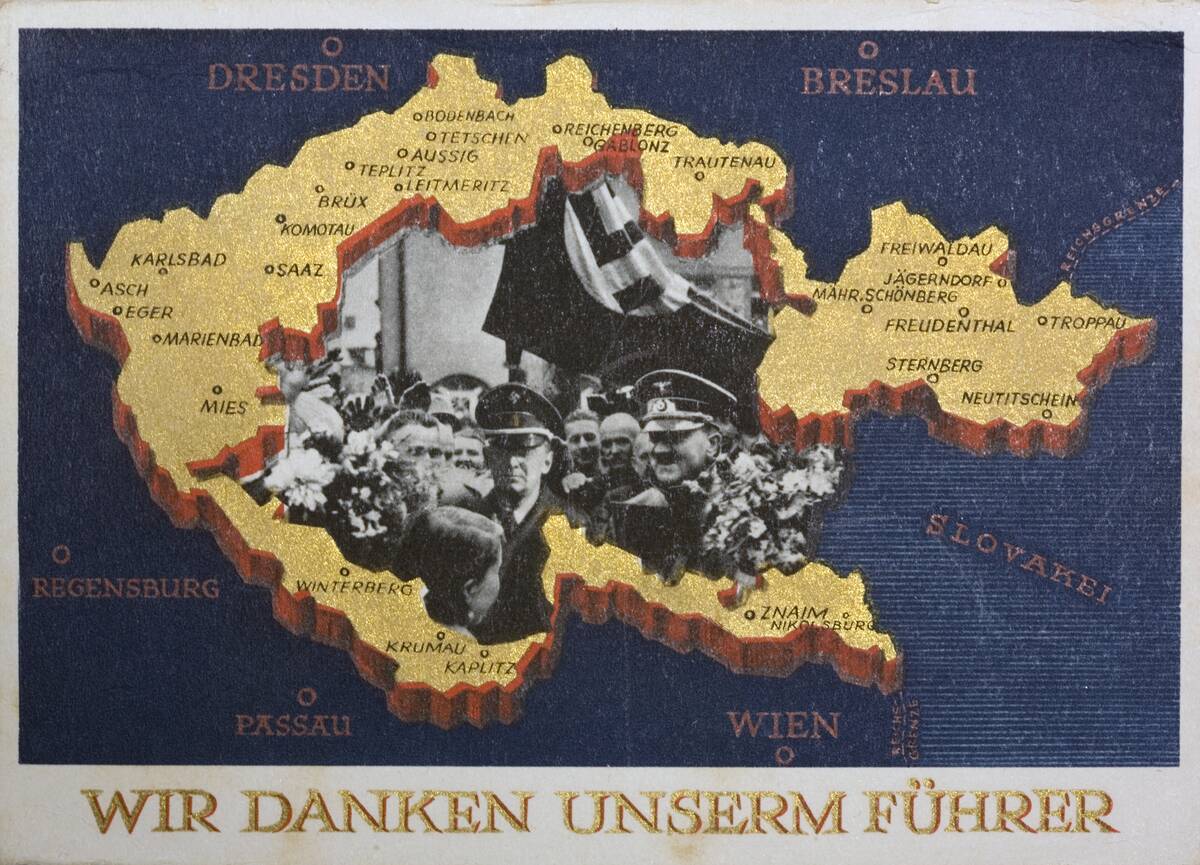
Similarly, the “Nazi Propaganda Maps” of the 1930s and 40s were designed to justify territorial ambitions and racial ideologies. These maps went beyond geography to tell stories aligned with political agendas, demonstrating the map’s capacity to shape historical narratives and public consciousness.
The Transition from Persuasive to Informative Cartography
As technology advanced, cartography gradually shifted from persuasion to information. The 19th century saw the emergence of more scientific approaches to mapmaking, emphasizing accuracy and objectivity. This transition was driven by the demands of exploration, commerce, and the emerging field of geography as a science.
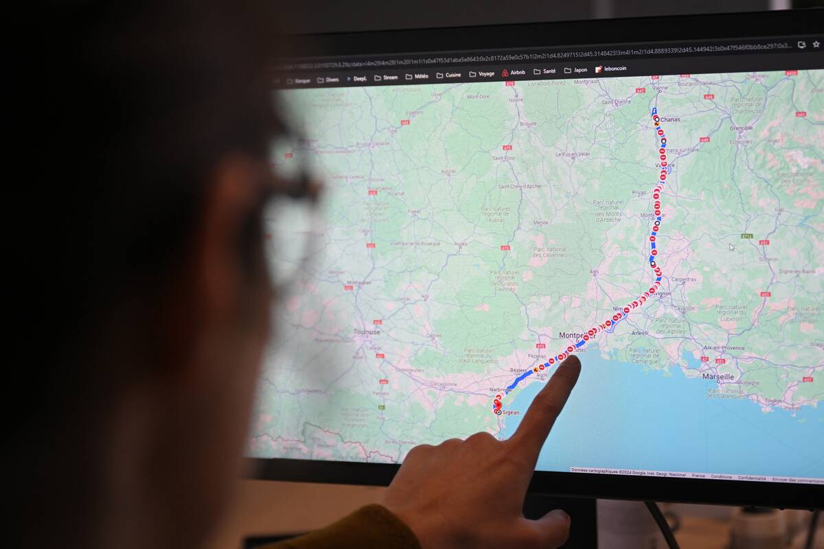
Today, digital mapping technologies like GIS and satellite imagery continue to prioritize accuracy, offering users precise and reliable data. This evolution reflects a broader societal shift towards transparency and information accessibility.
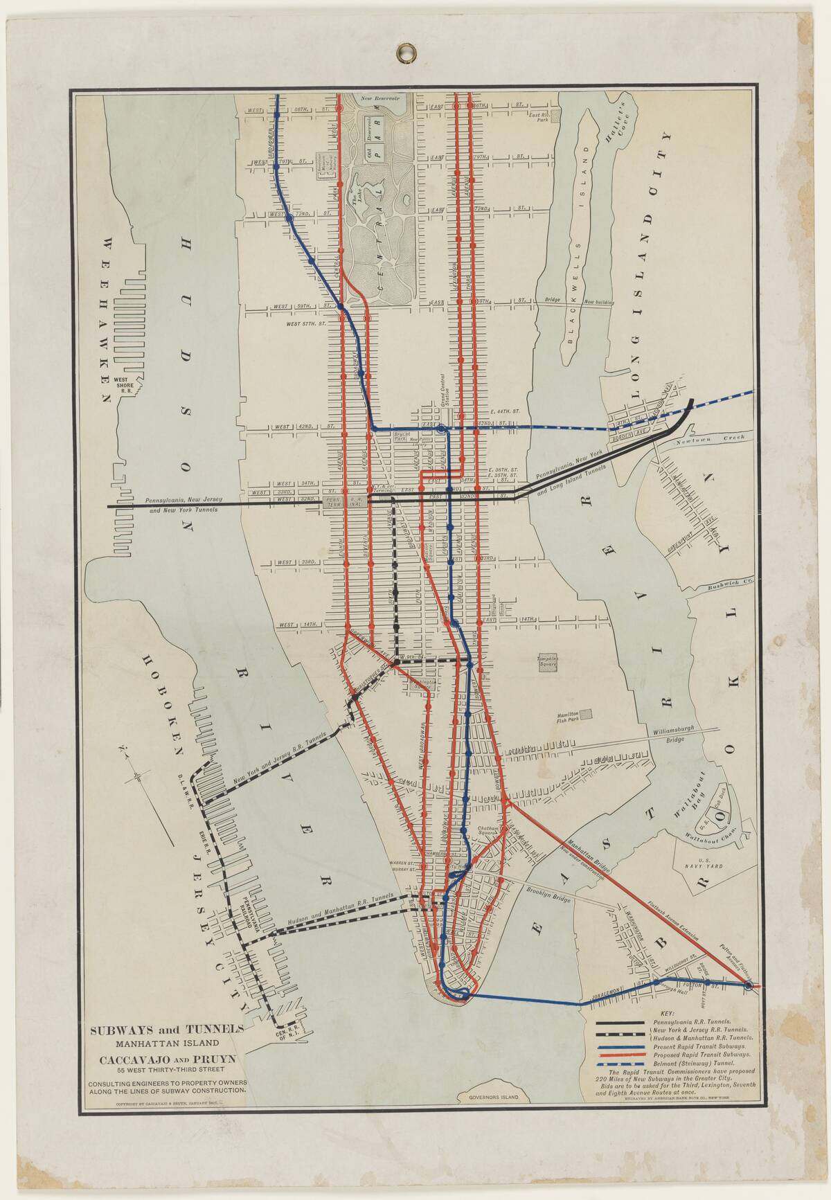
The Impact of Technology on Modern Map Design
Technology has revolutionized modern map design, making it possible to create highly detailed and interactive maps. Geographic Information Systems (GIS) allow for the layering of diverse data sets, offering insights into demographics, environmental changes, and urban development. Satellite imagery and GPS technology provide real-time updates, enhancing navigation and spatial analysis.
This technological advancement has made maps more accessible and user-friendly, empowering individuals and organizations to make informed decisions based on accurate geographic data.
Recognizing Bias in Contemporary Maps
Even in the age of digital cartography, bias in maps remains a concern. The choices made in data selection, scale, and design can influence how information is presented and perceived. For instance, the emphasis on certain data points over others can skew understanding, intentionally or unintentionally.
Recognizing these biases is crucial for users to critically evaluate maps and the information they convey. By understanding the underlying assumptions and decisions in mapmaking, viewers can better interpret and apply the data presented.