Maps that changed how humanity viewed the world
Maps have long been our windows to the world, shaping how we perceive geography and our place within it. From ancient times to the digital era, each map reflects the zeitgeist of its creation.
They are not just tools for navigation but also powerful instruments of knowledge, politics, and even art. These graphical representations help us understand the world’s complexity and our endless quest to explore the unknown.
The Ancient World: The Babylonian World Map
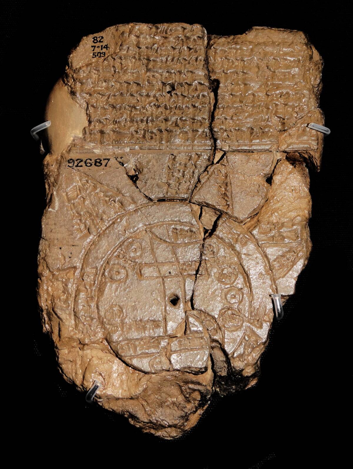
The Babylonian World Map, created sometime after the 9th century BCE, is an astonishing artifact of ancient cartography. Found in Sippar, Iraq, this clay tablet depicts the world as a flat disc surrounded by a ring of water, known as the “Bitter River.”
It highlights the Babylonian perspective on geography, with Babylon at the center, underscoring the cultural and spiritual significance of their civilization. This map is a testament to the Babylonians’ understanding of their environment and cosmology.
Ptolemy’s Geographia: A Game-Changer in Cartography
Ptolemy’s Geographia, penned in the 2nd century, marked a pivotal moment in the history of cartography. This comprehensive work compiled Roman, Greek, and Persian knowledge of the world, introducing the concept of latitude and longitude.
Although his maps were not entirely accurate by modern standards, they laid the groundwork for future cartographers, influencing mapmaking for over a millennium. Ptolemy’s vision extended beyond geography, shaping the fields of astronomy and mathematics as well.
The Tabula Rogeriana: Bridging the East and West
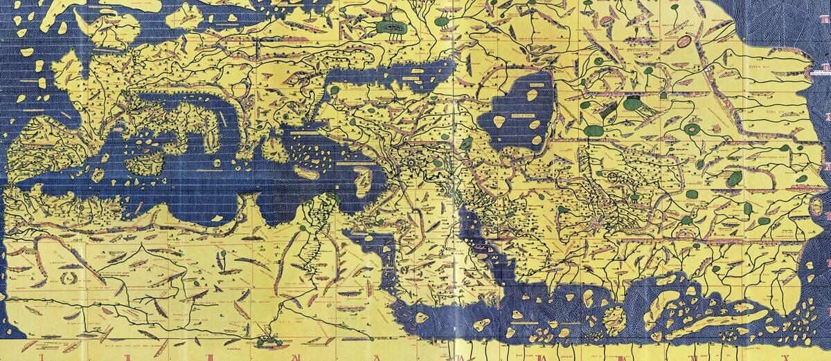
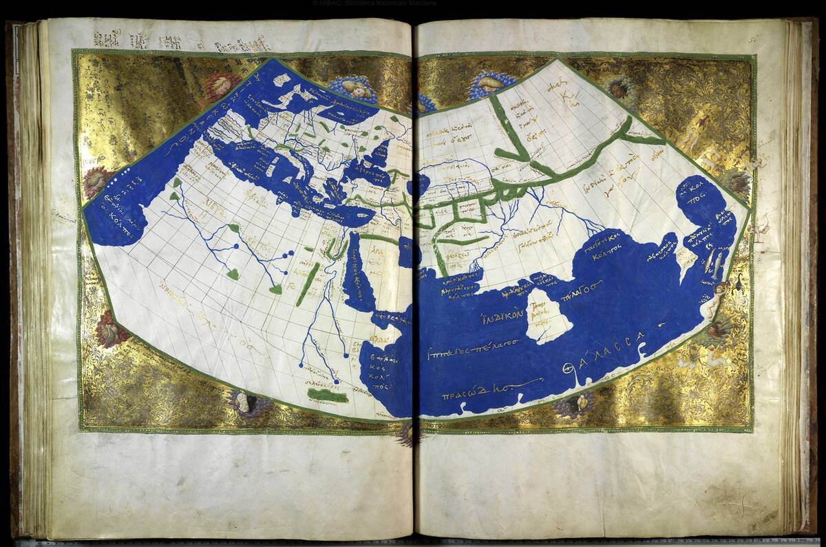
The Tabula Rogeriana, created by Muhammad al-Idrisi in 1154, serves as a bridge between Eastern and Western knowledge. Commissioned by King Roger II of Sicily, this map was a culmination of al-Idrisi’s extensive travels and research.
It offered a remarkably accurate depiction of Europe, North Africa, and Asia, with South positioned at the top. This orientation reflects the Islamic tradition of placing Mecca at the center, illustrating cultural influences on mapmaking.
The Hereford Mappa Mundi: A Medieval Marvel
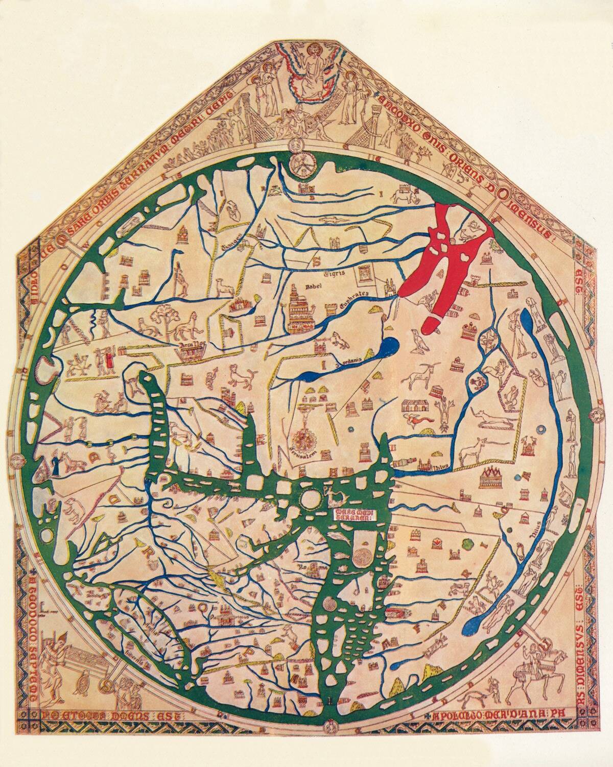
The Hereford Mappa Mundi, crafted around 1300, is a rich tapestry of medieval thought and religious perspective. Housed in Hereford Cathedral in England, it is the largest known medieval map, measuring over four feet in diameter.
Jerusalem sits prominently at its center, with Biblical events and mythical creatures scattered throughout. This map is not only a geographical guide but also a spiritual one, reflecting the medieval understanding of the world and cosmos.
The Cantino Planisphere: The Dawn of the Age of Discovery
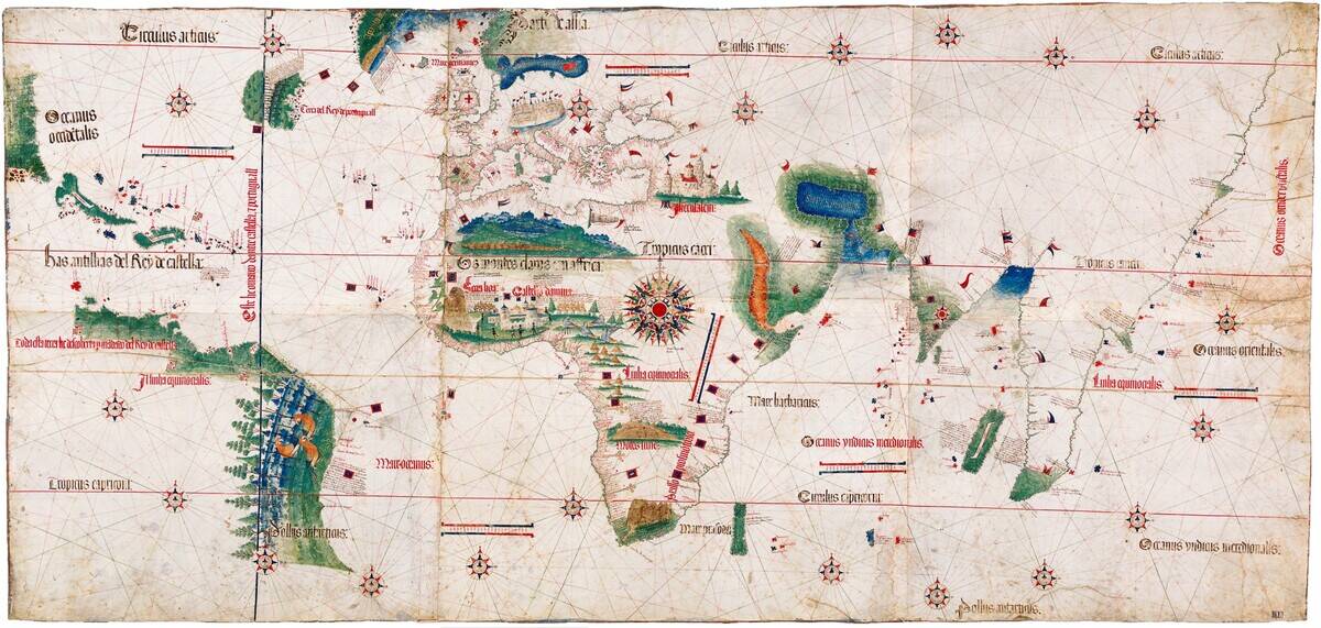
The Cantino Planisphere, dated 1502, captures the exhilarating dawn of the Age of Discovery. Named after an Italian spy who smuggled it out of Portugal, this map is among the earliest to showcase the New World.
It reflects the burgeoning European exploration, with detailed coastlines of Africa and Brazil. The Cantino Planisphere stands as a testament to human curiosity and the relentless drive to chart new territories, paving the way for future explorers.
The Waldseemüller Map: America’s Big Debut
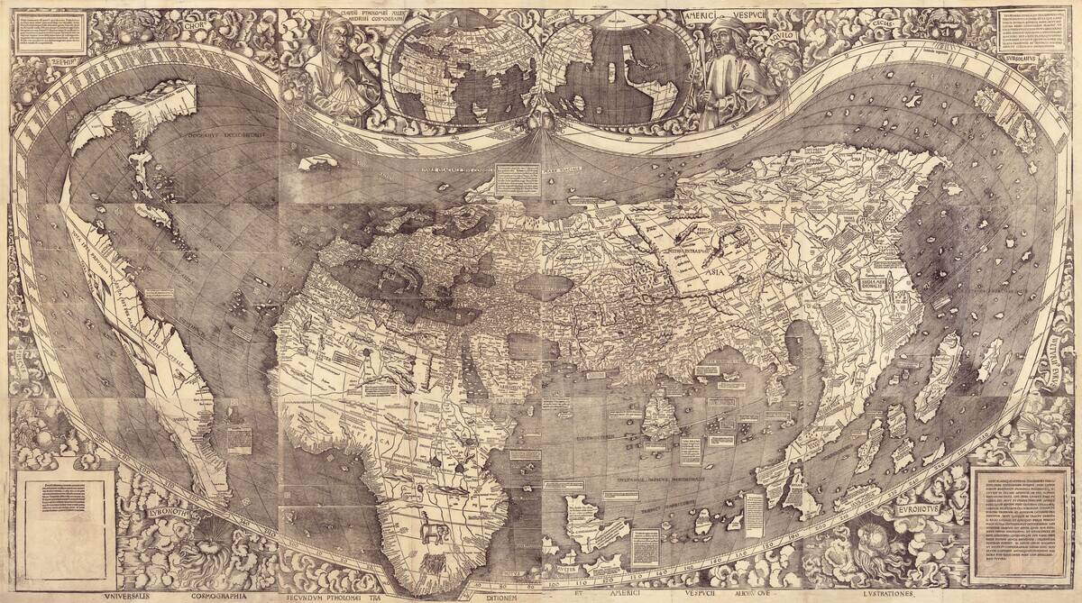
The 1507 Waldseemüller Map is famous for being the first map to use the name “America.” Created by Martin Waldseemüller, this map was revolutionary in its depiction of the Western Hemisphere as separate from Asia.
It acknowledged Amerigo Vespucci’s voyages, attributing the continent’s name to him. With only one surviving copy housed in the Library of Congress, this map is a crucial piece of cartographic history, sparking the naming convention still in use today.
The Mercator Projection: Navigating the Seas with Precision
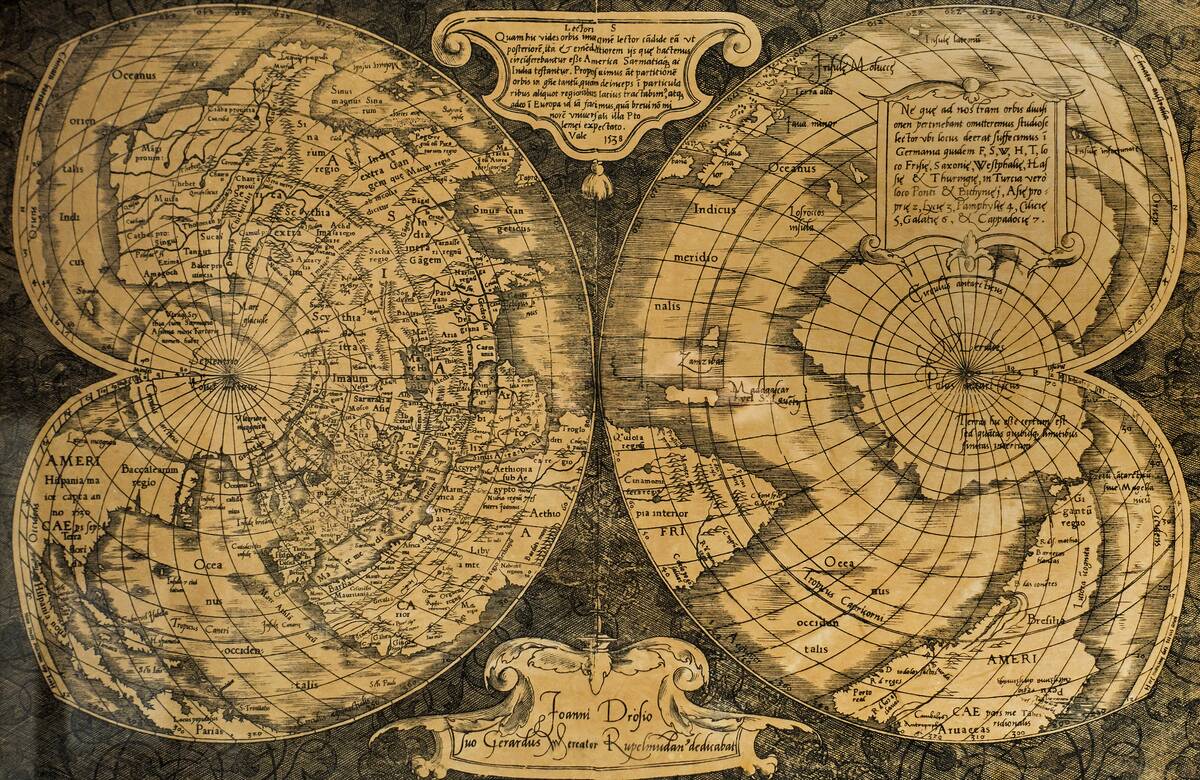
The Mercator Projection, introduced by Gerardus Mercator in 1569, revolutionized nautical navigation. By representing lines of constant course, known as rhumb lines, as straight segments, it became indispensable for sailors.
Despite its distortion of size, particularly near the poles, its utility in navigation was unparalleled. The projection underscores the trade-off between accuracy and practicality, influencing our geographic perception and maritime exploration for centuries.
The Blaeu Atlas: A 17th-Century Masterpiece
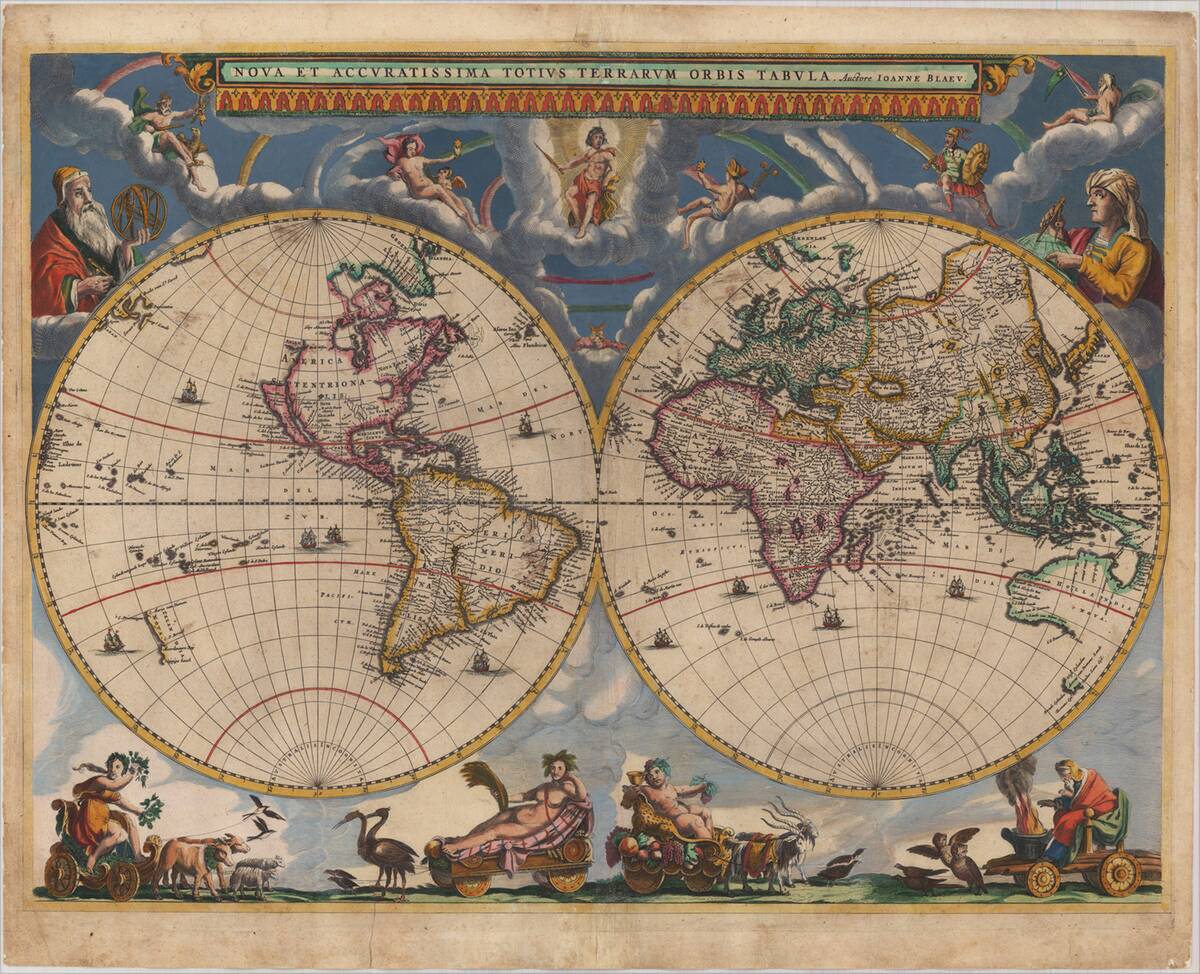
Published by Joan Blaeu in the 17th century, the Blaeu Atlas is a cartographic masterpiece. Known for its exquisite detail and artistry, this multi-volume atlas encompassed maps of the known world, becoming a symbol of the Dutch Golden Age.
Blaeu’s work combined scientific precision with artistic flourish, serving as a status symbol for the wealthy. This atlas is a testament to the era’s advances in navigation, trade, and geographic understanding.
The Cassini Map: France’s Cartographic Revolution
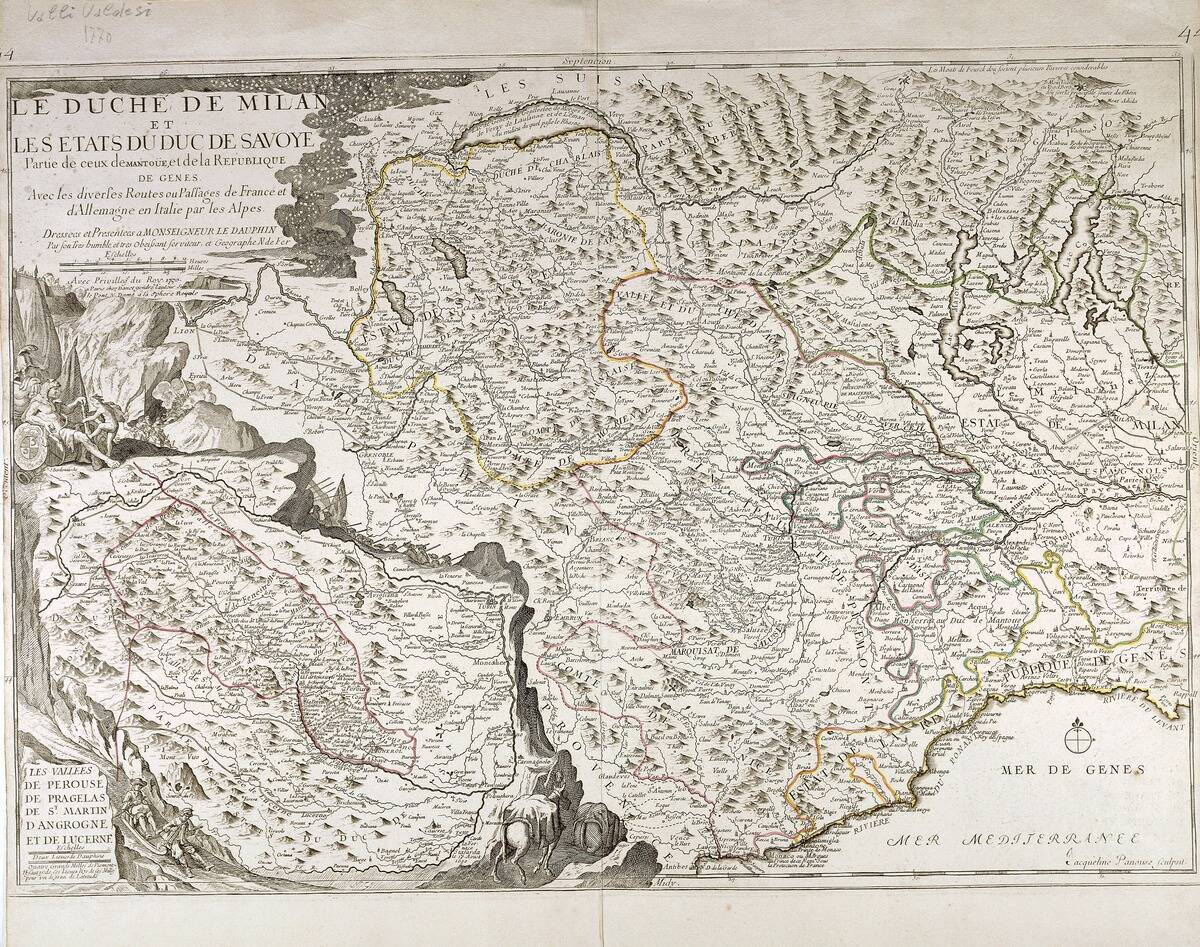
The Cassini Map, completed in the 18th century, marked a significant advancement in French cartography. Commissioned by King Louis XV, it was the first map to use triangulation extensively, offering unprecedented accuracy.
The project, led by the Cassini family, took over six decades to complete and covered the entirety of France. This map set new standards for topographic surveys and remains a pivotal achievement in the field of geographic science.
The John Snow Cholera Map: A Pioneer in Epidemiology
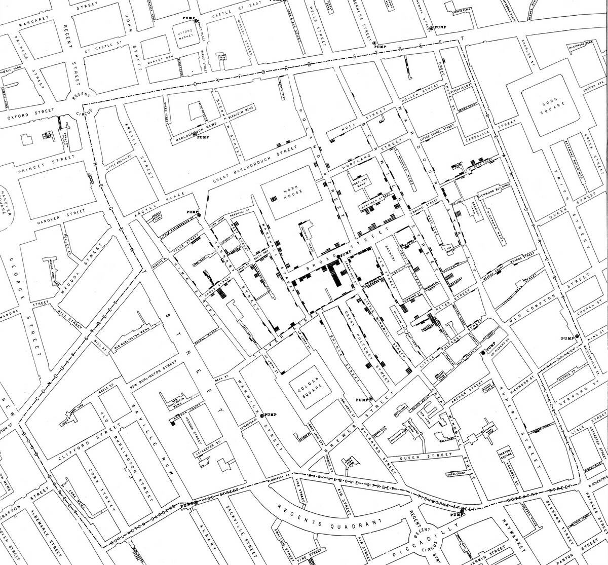
John Snow’s cholera map from 1854 is a pioneering work in the field of epidemiology. By mapping cholera cases in London, Snow identified a contaminated water pump as the source of the outbreak.
This map was groundbreaking, demonstrating how spatial analysis could be used to understand and combat disease. Snow’s work laid the foundation for modern public health initiatives, highlighting the power of maps beyond geography in saving lives and shaping scientific inquiry.
The London Underground Map: Redefining Urban Navigation
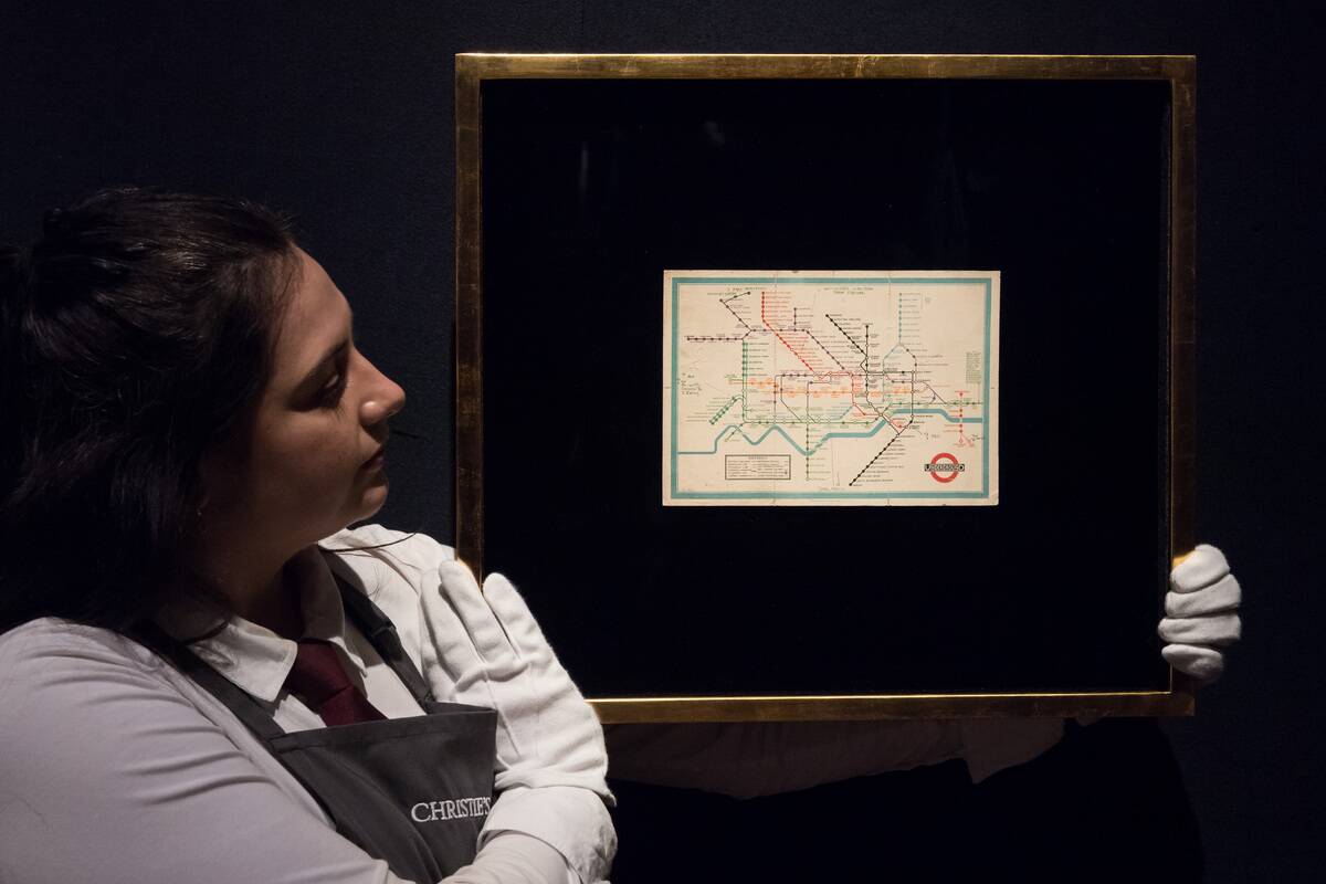
The London Underground Map, designed by Harry Beck in 1931, is an icon of urban navigation. By simplifying complex transit routes into a clear, schematic design, it revolutionized how people interact with public transport systems.
Beck’s map abandoned geographic accuracy for clarity and usability, a concept that has been adopted by transit systems worldwide. This map exemplifies how thoughtful design can transform everyday experiences, making cities more accessible and navigable.
The Peters Projection: A Controversial Perspective Shift
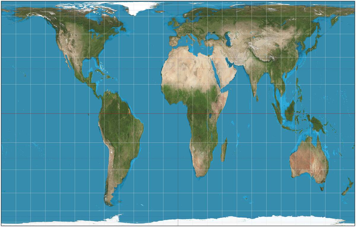
Introduced by Arno Peters in 1974, based on the work of James Gall a century earlier, the Peters Projection sparked heated debate in the cartographic community. Unlike the Mercator Projection, it aimed to represent all areas equally, highlighting the size of developing countries.
Critics argue that it distorts shape, but supporters praise its focus on fairness and equity. The Peters Projection challenges us to reconsider our worldview, illustrating how maps can influence perceptions of power and geography.
Google Maps: The Digital Era of Cartography
Since its launch in 2005, Google Maps has transformed how we navigate the world. Offering real-time directions, street views, and satellite imagery, it has become an indispensable tool for millions.
The platform continuously evolves, integrating user-generated content and advanced technologies like AI. Google Maps represents the democratization of cartography, making detailed geographic information accessible to anyone with an internet connection, and redefining our relationship with space and place.